389: One Branch Leads to Yes
30 Jul 2020For some reason, nobody asked us to testify before Congress.
Episode Description:
- Pre-show:
- Follow-up:
- Tech CEO Testimony to Congress
- Rumored Apple product-launch dates
- Big Sur’s New Look
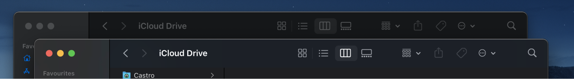
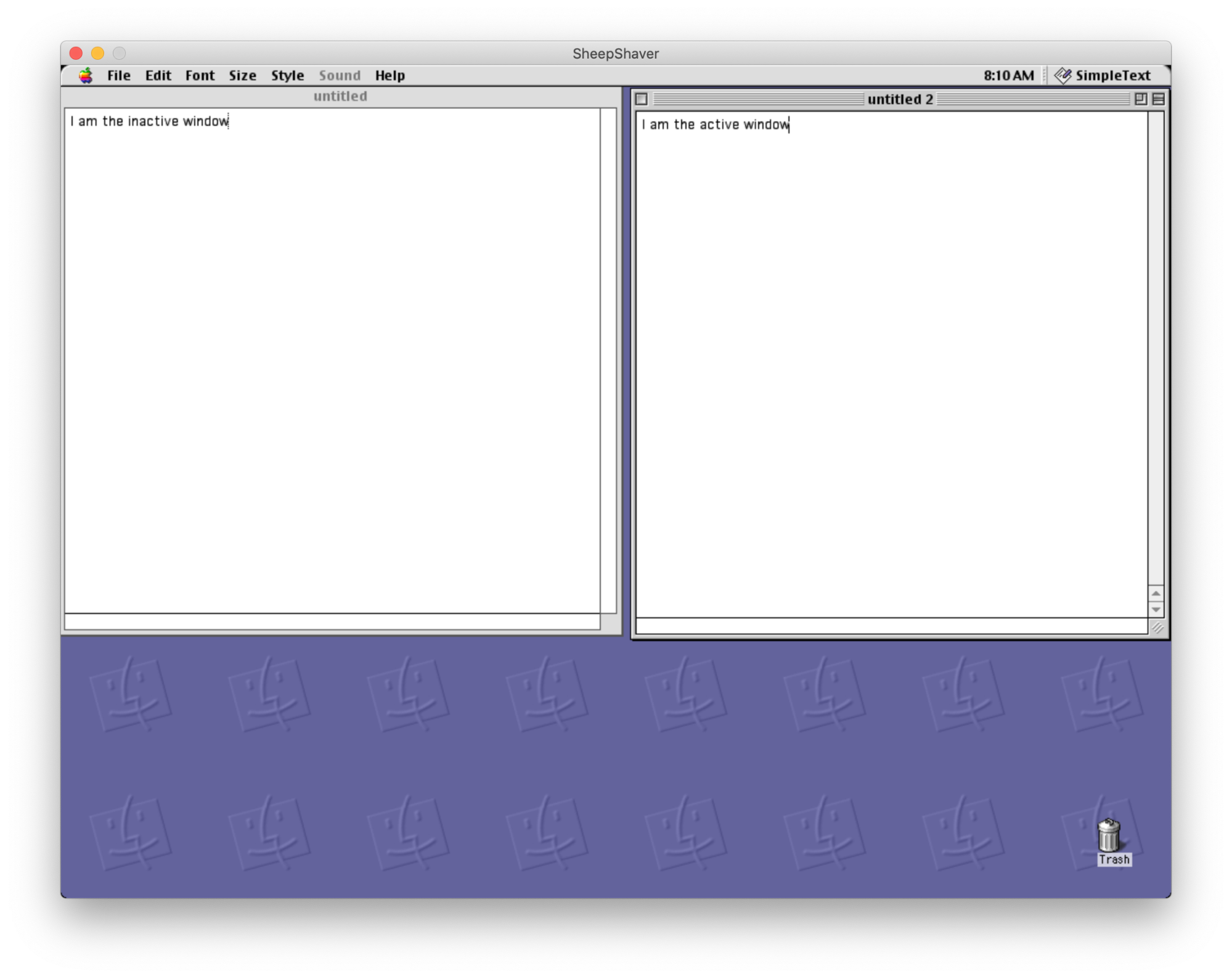
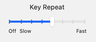
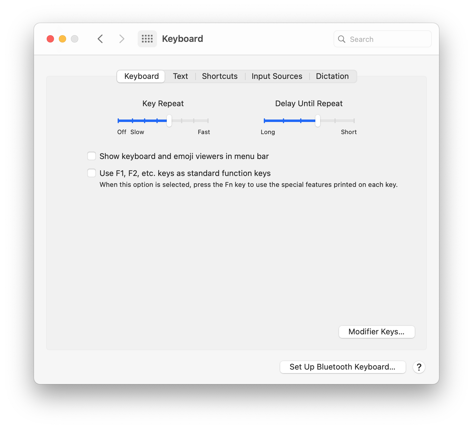
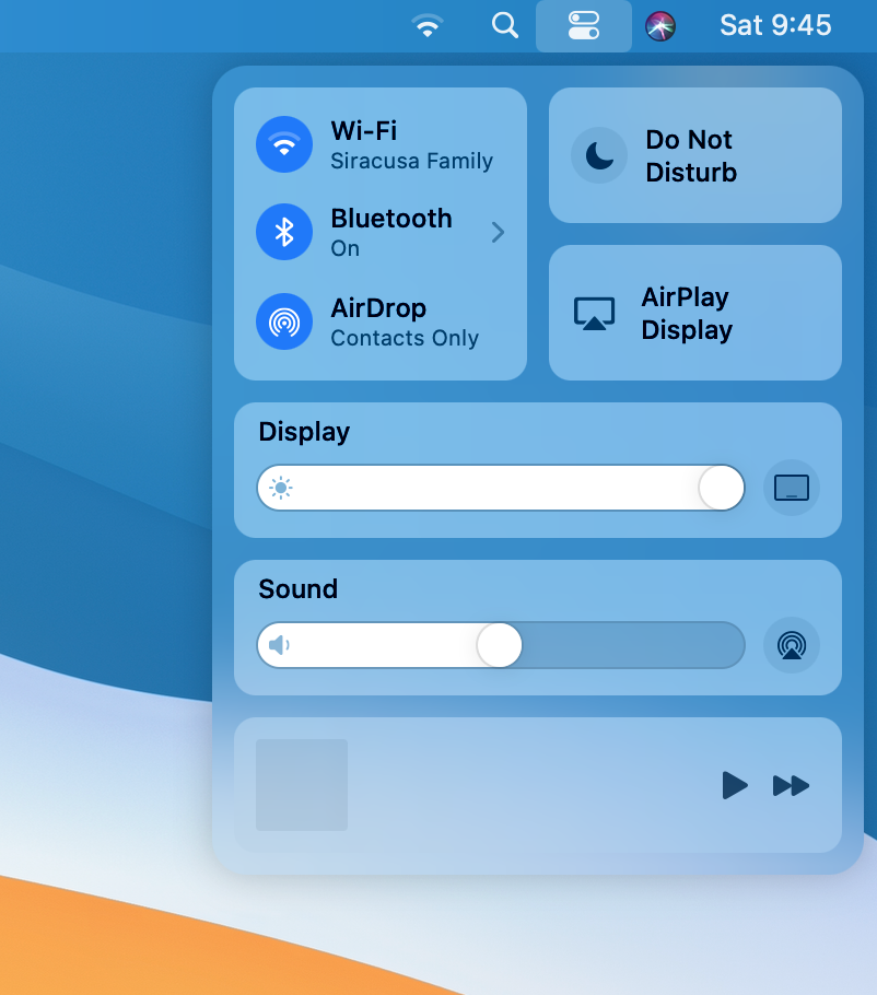
- Active Window
- Sliders
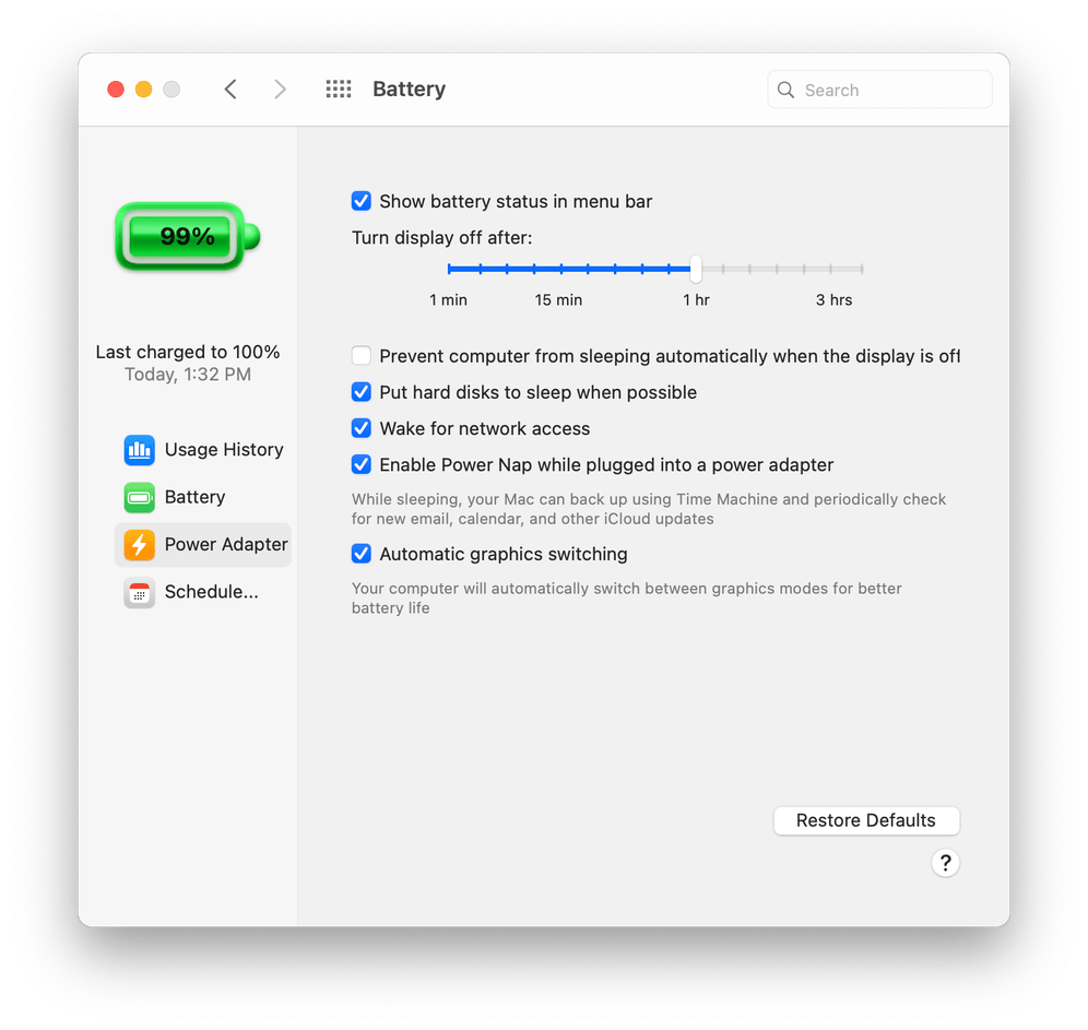
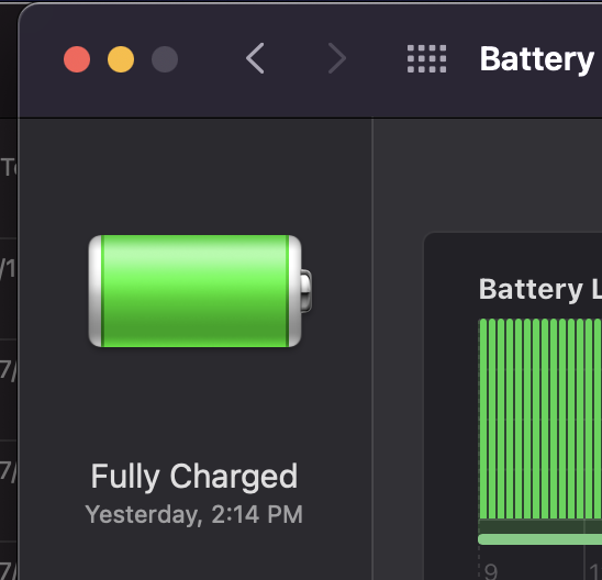
- Battery
- Icons
- Toolbars
- Control Center
- Alert
- Menu Bar
- Post-show: Marco accidentally reincarnated Neutral for fifteen minutes
Sponsored by:
- Linode: Instantly deploy and manage an SSD server in the Linode Cloud. New accounts get a $20 credit with code atp2020.
- Hey: Email shouldn’t be overwhelming. Start your free 14-day trial.
- Crypto Pro: All-in-one cryptocurrency portfolio app. Get a free month of Premium with code ATP.
Chapters
- Jobs with real liabilities
- Dithering
- Not follow-up
- Follow-up
- Sponsor: Crypto Pro (code ATP)
- Congressional hearing
- Sponsor: Hey.com
- Upcoming-events “leak”
- Sponsor: Linode (code atp2020)
- Big Sur design
- Ending theme
- Breaking our site
Jobs with real liabilities
⏹️ ▶️ Marco We are not testifying before Congress this week. They haven’t asked us yet, but you
⏹️ ▶️ Marco know, it’s not too late.
⏹️ ▶️ Casey We’re available. I would be happy to. Actually, no, I would not be happy to. It would, it sounds terrifying.
⏹️ ▶️ Casey My dad had to testify before the SEC once for work-related reasons. He was like,
⏹️ ▶️ Casey he was not in trouble at all. He was like a witness or something for the SEC. And I remember
⏹️ ▶️ Casey my dad doesn’t get scared, doesn’t get shaken easily. And he was
⏹️ ▶️ Casey terrified for months leading up to this, like absolutely friggin terrified and I don’t blame him. So as much as I joke
⏹️ ▶️ Casey about, oh yeah, I’ll go to Congress. Sure. Why not? Like, I don’t know. That seems, that seems unenjoyable
⏹️ ▶️ Marco I’ve never worked in anything that could have led to serious consequences. If I did anything wrong,
⏹️ ▶️ Marco I’ve always worked on fairly low stakes things. Like I felt a lot of pressure to, you know,
⏹️ ▶️ Marco keep the site up. Right. But like, it wasn’t like, if I, if I messed up, I didn’t go to jail
⏹️ ▶️ Marco and nobody died. And it wasn’t like, you know, major problems happening if I screwed something up, right.
⏹️ ▶️ Marco You know, I might lose my job if I screwed something up badly enough, but I wouldn’t like be criminally liable for
⏹️ ▶️ Marco anything. And like, there’s so many jobs that that’s not the case that like, you know, there are significant
⏹️ ▶️ Marco ramifications if you mess something up, including like personal liability ramifications
⏹️ ▶️ Marco for you personally. And so it’s, yeah, I consider myself very lucky that I, you know,
⏹️ ▶️ Marco I’ve dedicated most of my career to like helping people waste time, basically.
⏹️ ▶️ Casey Yeah, it’s funny you bring that up. I’ve told this story on other podcasts and probably on this one, but there’s a window of time.
⏹️ ▶️ Casey I worked for a company that wrote navigation systems for very, very large boats, like cruise ships
⏹️ ▶️ Casey and stuff like that. And at one point, I was doing a bug fix for the mob feature,
⏹️ ▶️ Casey MOB. And at first I was like, I don’t even know what that means. And then I quickly learned that that
⏹️ ▶️ Casey meant man overboard. And the idea was it would try to use whatever it knew about winds
⏹️ ▶️ Casey and currents and the speed of the boat at the time you hit the button and so on and so forth to do a little bit of like, this is
⏹️ ▶️ Casey a terrible use in this context, but to do dead reckoning to try to figure out like where’s the person
⏹️ ▶️ Casey that’s overboard so you can swoop around and hopefully go pick them up. And it was when I was working on this feature,
⏹️ ▶️ Casey this bug that I realized, unlike the job before when I was working on bingo
⏹️ ▶️ Casey machines that were allegedly that were masquerading as slot machines, but they were really just bingo machines.
⏹️ ▶️ Casey This stuff, this actually kind of matters. This is kind of a big deal. And it’s funny because
⏹️ ▶️ Casey that particular job, that was far and away the most difficult job
⏹️ ▶️ Casey to get any code change into source control
⏹️ ▶️ Casey because you had to do all sorts of testing, you had to have independent testing, all of which is good. I don’t think any of this is bad, but
⏹️ ▶️ Casey it was very, very challenging going from a completely grab-hiny
⏹️ ▶️ Casey organization that I had come from with the slot machines where it was like, ah, whatever, whee! And you know, shoot
⏹️ ▶️ Casey from the hip, pew, pew, pew! And next thing I know, it’s like, you know, you have to, we were using like the
⏹️ ▶️ Casey rational suite for source control and issue tracking, which was awful. And you couldn’t
⏹️ ▶️ Casey do anything to the code without associating it with a, like a bug that you were fixing, which
⏹️ ▶️ Casey was a pain. But all of this was for good reason, and it was like a CMMI level 3, or 2
⏹️ ▶️ Casey or 3, I forget which one it was, which basically means that
⏹️ ▶️ Casey when we had said it will take six months to get that feature done, the first thing everyone said was, you’re kidding, this is
⏹️ ▶️ Casey the smallest feature in the world. But the second thing that happened was it took six months to get the feature done, because there was so
⏹️ ▶️ Casey much like, this was Waterfall taken to the extreme, right? And there was so much like red tape and pre-planning
⏹️ ▶️ Casey and pre-pre-pre-planning and so on and so forth But the good news was, by the
⏹️ ▶️ Casey time you actually got to writing code, it was almost already done at that point. So
⏹️ ▶️ Casey we shipped very reliably, even though it was just a suffocating place to work. And it
⏹️ ▶️ Casey wasn’t, again, like for good reason. I’m not really complaining about it. But yeah, outside of
⏹️ ▶️ Casey that, I’ve done nothing that matters in my entire career. I don’t know, that was a very weird tangent.
⏹️ ▶️ Casey I’m in a little bit of a goofy mood tonight. Us? Yeah, I know, right? Ha ha ha. you
Dithering
⏹️ ▶️ Casey I don’t know if this is not in good taste. I think it’s fine. But
⏹️ ▶️ Casey I was listening to, I believe it was Today’s Dithering, speaking of tangents,
⏹️ ▶️ Casey and they were covering the testimony that was going to happen today.
⏹️ ▶️ Casey And oh my goodness, like the entire, the dithering is so good to begin with, but that particular
⏹️ ▶️ Casey episode, I don’t know if you two have heard it yet, But I felt like every single ounce of it was
⏹️ ▶️ Casey so incredibly accurate and well done. And if you are a dithering listener,
⏹️ ▶️ Casey I really encourage you to listen to that episode. Do not skip it. And if you’re not, I definitely encourage you to try it.
⏹️ ▶️ Casey It is very, very good. Have you guys heard today’s?
⏹️ ▶️ Marco No, not yet. But I will echo the endorsement for listening to dithering. I find it wonderful. I listen
⏹️ ▶️ Marco quite a lot. It’s like, because, you know, they released it. This is the drunk grouper Ben Thompson $5
⏹️ ▶️ Marco a month paid 15 minute each episode What two or three times a week three times?
⏹️ ▶️ Marco It’s really good. It’s not just like the talk show. You know, it’s it’s something new
⏹️ ▶️ Marco and I really enjoy it and I definitely recommend You know many of you out there have
⏹️ ▶️ Marco Been on board with the paid podcast train recently and if you’re on that if you’re on board that paid podcast train Thank you.
⏹️ ▶️ Marco Add this one to your list. Yeah, do the ring. Hold on to it.
Not follow-up
⏹️ ▶️ Casey I don’t know. I haven’t really paid any attention to this stuff today. I probably should have, if I’m honest,
⏹️ ▶️ Casey but I just didn’t have the energy for it. Have you guys watched it
⏹️ ▶️ Casey, John to it all? It’s
⏹️ ▶️ John the topic list for crying out loud. Scroll down. All
⏹️ ▶️ Casey right. Well, all right. So if we’re going to do bad cop, then I’ll also join you in being bad cop. John, you’ve done way too much homework
⏹️ ▶️ Marco There’s a ton of John homework here.
⏹️ ▶️ John Apparently not enough because both of you tried to talk about a topic before we even
⏹️ ▶️ Casey that’s irrelevant. That is absolutely irrelevant or tangential to this conversation. Why are you doing
⏹️ ▶️ John This is like, I don’t know, this has been in there for a while. And like I said last week we don’t have a set of content hosting and
⏹️ ▶️ John I didn’t want Marco to work on it. So I just uploaded all the images to my website, but then you need all the links and that’s fine.
⏹️ ▶️ Casey, John be fair, even
⏹️ ▶️ Casey though I am being bad cop, because I like to think of myself as a nice guy, now I have to backpedal a little bit. So the
⏹️ ▶️ Casey homework I’m referring to is that later on, certainly not now, John, we’re going to talk about
⏹️ ▶️ Casey Big Sur’s new look. And as John just
⏹️ ▶️ Casey said, not only has he uploaded all of these helpful images to his website,
⏹️ ▶️ Casey not only has he provided URLs for all of these, but he actually, and this is how you know John is actually a
⏹️ ▶️ Casey nice guy, even though he likes to play bad cop, he actually put markdown ready
⏹️ ▶️ Casey links in our show notes. So for me, because I typically are the first stage in completing the show
⏹️ ▶️ Casey, John notes. That’s how
⏹️ ▶️ Casey true. That’s the less charitable take. Here it is. I’m trying to bring this back around to being good.
⏹️ ▶️ John leave the HTTPS off a bunch of links, you know.
⏹️ ▶️ Casey Anyway, let me just try to compliment you even though you don’t deserve it, you jerk. I appreciate the fact that you’ve put all
⏹️ ▶️ Casey this work in so I do not
⏹️ ▶️ John to. I’m using some of the skills that I learned at my jobby job, which is if you just put in a bunch of image, people think you did a lot of
⏹️ ▶️ John work. So all of it, all these images,
⏹️ ▶️ John, Marco that must have been a lot of work.
⏹️ ▶️ John to paste an image than it is to write stuff. I write a hundred bullet points, it’s like, ah, you did nothing. I paste in
⏹️ ▶️ John one image, it’s like, wow, you did a lot of work. A lot
⏹️ ▶️ John, Casey of work that
⏹️ ▶️ Casey Oh my word. All right. I guess we should do some follow-up before John gets really upset.
Follow-up
⏹️ ▶️ Casey And we should say that John, it seems like you may have solved your
⏹️ ▶️ Casey Mac Pro waking up for no good reason issues.
⏹️ ▶️ John No, of course not. This is one of those
⏹️ ▶️ John, Casey follow-up items.
⏹️ ▶️ John So many people suggested it that I need to talk about it on the program because it doesn’t work, right? So this
⏹️ ▶️ John is the thing. I had already tried this many many moons ago, but people suggested it a lot. So
⏹️ ▶️ John I wanted to reinforce that this does not work. So my problem to recap was my computer would be dead asleep.
⏹️ ▶️ John My Mac Pro is dead asleep. Every you know fans are not spinning the computer is asleep and then a reminder
⏹️ ▶️ John will happen and it will wake my Mac up You know so it can put the
⏹️ ▶️ John little notification reminder on the screen And I just had last show I do want notifications enabled
⏹️ ▶️ John for reminders on my Mac because when I’m sitting there using my Mac It’s nice to get a reminder of a thing. Maybe my
⏹️ ▶️ John phone’s not with me. I want reminders to be there I do not want reminders to wake my Mac up when I’m like not even
⏹️ ▶️ John home because then my Mac wakes up and it’s hot little room with no air conditioning
⏹️ ▶️ John and and I have my Mac set up to not go to sleep for a very long time. In general, I like to sort
⏹️ ▶️ John of manually control. When I put it to sleep, I want it to stay asleep, and when I wake it up, I want it to stay awake. That’s
⏹️ ▶️ John just how I use my Mac Pro, but Reminders has other plans. And I didn’t say this last week
⏹️ ▶️ John and no one mentioned it, but I’m assuming that what’s waking it up with Reminders is not push notifications
⏹️ ▶️ John or listening on the network, but just basically, you know, if I were to look in my sleep logs, it would be like Wake Reason
⏹️ ▶️ John RTC, which is like real-time clock. Like, it’s just time-based. If it knows this is gonna be a reminder, you know, the same way my computer
⏹️ ▶️ John wakes up every night and does a backup, right? The same way I have my time super duper backups, like
⏹️ ▶️ John it all happens while I’m sleeping. You can schedule, wake from sleep and shut down in the Energy
⏹️ ▶️ John Saver thing. Anyway, same deal. So there’s an option in the notifications preference pane under the
⏹️ ▶️ John do not disturb item. There’s a checkbox that says, turn on do not disturb.
⏹️ ▶️ John And it has a bunch of conditions under which you can turn on. Turn on do not disturb when the screen is locked, turn on do not disturb when mirroring
⏹️ ▶️ John to TVs or projectors. and turn on do not disturb when the display is sleeping. And I have all those
⏹️ ▶️ John checked off and always have. Doesn’t matter. Because yes, technically
⏹️ ▶️ John I suppose the display is sleeping when the entire computer is asleep, but that does not
⏹️ ▶️ John prevent reminders from waking my computer up. I think what they mean is when your computer is awake but when your display is asleep,
⏹️ ▶️ John I honestly don’t even know.
⏹️ ▶️ John as far as I can tell, there is still no way to stop reminders from waking up your Mac,
⏹️ ▶️ John except for just turning off reminders, turning off the notifications for reminders entirely.
⏹️ ▶️ Casey Alrighty, and then it sounds like Intel is, whoa, not in a good spot. What’s
⏹️ ▶️ John And we just got done answering a question of like, what happened to Intel? What’s the deal with them? And of course, Apple
⏹️ ▶️ John moving to ARM and everything like that. We said they were behind on their process and they just had another announcement that
⏹️ ▶️ John their next process shrink to seven nanometer is delayed. Here’s a quote from
⏹️ ▶️ John Apple, oh, Apple, Intel CEO, Bob Swan. We now expect to see the initial production shipments
⏹️ ▶️ John for our Intel based seven nanometer product a client CPU in late 2022 or early 2023
⏹️ ▶️ John That’s not good news. Nope. Uh, apple’s going to be shipping five nanometer
⏹️ ▶️ John max like this year And they’re saying their seven nanometer process, which is roughly comparable
⏹️ ▶️ John 2022 or 2023 The hits keep coming from intel and in
⏹️ ▶️ John the same We’ll put a link to is a story about it from Tom’s hardware and the same sort of press release story
⏹️ ▶️ John Whatever they hinted at the possibility of like well This is not gonna stop us if Intel
⏹️ ▶️ John needs to I figure what the euphemism was it was like Additional fab resources.
⏹️ ▶️ John They basically said like maybe we’ll get someone else to make our chips for us because we’re really bad at it And that’s got
⏹️ ▶️ John all people speculating like maybe they’ll get out of the fab business and just give up entirely and just be entirely
⏹️ ▶️ John fabulous Anyway, Intel is not doing well And I’m sure like
⏹️ ▶️ John people are saying oh Apple dodged a bullet on that one This is the type of thing that Apple would know well before we would because
⏹️ ▶️ John they’re partners with Intel But even without this announcement just the 10 nanometer delay was so
⏹️ ▶️ John crippling and terrible that that was More than enough to justify Apple’s decision to get off of Intel so
Sponsor: Crypto Pro (code ATP)
⏹️ ▶️ Marco We are sponsored this week by Crypto Pro, the all-in-one cryptocurrency
⏹️ ▶️ Marco tracking app. You can view market prices, read news, set price alerts, and monitor your
⏹️ ▶️ Marco crypto portfolio. Crypto Pro is fully native with support for iOS,
⏹️ ▶️ Marco iPadOS, watchOS, and macOS via Catalyst, and they support
⏹️ ▶️ Marco all modern Apple features that you would expect. They have a today widget to view prices or your portfolio
⏹️ ▶️ Marco or news. They have complications for watchOS. You can view complications right on your Apple Watch. They
⏹️ ▶️ Marco have a Mac OS menu bar widget, full Siri support. You can do things like, Hey Siri, Bitcoin
⏹️ ▶️ Marco price. They also support Face ID or Touch ID so you could lock your portfolio.
⏹️ ▶️ Marco And they are built for privacy first. So they use iCloud for sync and
⏹️ ▶️ Marco they have no user data collection. Sensitive credentials are stored using Apple’s key chain. So they
⏹️ ▶️ Marco really respect and protect your privacy. For iOS 14 coming up soon. They
⏹️ ▶️ Marco hope on day one to be able to offer iOS 14 native widgets and Big Sur Catalyst
⏹️ ▶️ Marco app improvements. So they really are on the ball with modern Apple tech and getting it out there updated natively
⏹️ ▶️ Marco and quickly as the platform moves forward. Crypto Pro is also taking all this great talent and
⏹️ ▶️ Marco making a great stocks portfolio app coming soon. You can see more and maybe join the test
⏹️ ▶️ Marco flight beta at our link, CryptoPro.app. So you, our listeners,
⏹️ ▶️ Marco if you want to get CryptoPro or learn more about the CryptoPro stock coming out soon, go
⏹️ ▶️ Marco to CryptoPro.app for more information. And you can use code ATP for one month
⏹️ ▶️ Marco of free premium service. This gives you real time prices, portfolio sync from exchanges
⏹️ ▶️ Marco and wallets, advanced charts and curated market updates. So once again, CryptoPro
⏹️ ▶️ Marco at CryptoPro.app, this wonderful cryptocurrency tracking app And using code ATP, you can
⏹️ ▶️ Marco get a free month of Crypto Pro Premium with real time prices, portfolio sync from exchanges and wallets,
⏹️ ▶️ Marco advanced charts, and curated market updates. Thank you so much to Crypto Pro for sponsoring
Congressional hearing
⏹️ ▶️ Casey Now, am I allowed to talk about the CEO testimony?
⏹️ ▶️ John look at that. Wow. Here’s a timely topic that we can discuss.
⏹️ ▶️ John, Casey Imagine that.
⏹️ ▶️ Casey Some tech CEOs had some testimony to Congress today. I didn’t pay attention to any of it, and I
⏹️ ▶️ Casey hear it was a ride and not a very good one.
⏹️ ▶️ John Did you watch it, Marco?
⏹️ ▶️ Marco I didn’t really watch it either because…
⏹️ ▶️ Marco people do all day? anything else. I mean, here’s the
⏹️ ▶️ Marco thing, like, you know, I read all the recaps, I saw some of the quotes and some of the clips and everything
⏹️ ▶️ Marco of what, you know, what was actually noteworthy. You have a bunch of
⏹️ ▶️ Marco big corporate CEOs being interviewed by
⏹️ ▶️ Marco some clueful but many clueless idiot politicians.
⏹️ ▶️ Marco That’s not gonna provide that much value. All it’s gonna do, first of all, it’s not going to do anything in regard
⏹️ ▶️ Marco to making any meaningful change happen with any of these companies and their practices and everything. It’s also
⏹️ ▶️ Marco way too broad of a panel. Each of these companies should be investigated separately
⏹️ ▶️ Marco for separate issues that they have. To just invite all of these big tech companies,
⏹️ ▶️ Marco CEOs, to one big barrage of people basically grandstanding
⏹️ ▶️ Marco at them and beating them up and saying, why is my phone broken and why don’t you let conservative a few points on your
⏹️ ▶️ Marco platform that actually empowers them more than it should. You know, there’s so many issues here.
⏹️ ▶️ Marco This is not gonna achieve anything except making everyone look bad at best.
⏹️ ▶️ Marco And I think, based on what I saw, I think most of them did look bad. I think Tim Cook looked
⏹️ ▶️ Marco the worst out of all of them because I know the most about what he was talking about. And he proved
⏹️ ▶️ Marco himself to be one of the biggest BS artists there. Apple’s peddling a lot of BS when it comes to their App
⏹️ ▶️ Marco Store policies. and I hope they know it, because if they don’t know it, they’re really clueless.
⏹️ ▶️ Marco I’d rather, in this case, I hope that they know all the BS they’re peddling instead of actually believing what they’re saying.
⏹️ ▶️ Marco But regardless, the rest of them, you know, Zuckerberg is always
⏹️ ▶️ Marco a dick. Let’s be honest.
⏹️ ▶️ Marco The other ones basically didn’t surprise anyone. But I think, honestly,
⏹️ ▶️ Marco I think Apple is continuing to have a very, very bad look
⏹️ ▶️ Marco around this topic because they look at best like liars. And that’s
⏹️ ▶️ Marco at best because the way that they are excusing a lot of their behavior or the way they are trying to
⏹️ ▶️ Marco rewrite history or the way they’re trying to reframe the conversation, all of which point to they’re just basically being
⏹️ ▶️ Marco like, you know, exactly what you’d expect from a typical fast and loose
⏹️ ▶️ Marco playing CEO, politician kind of combo. And we expect
⏹️ ▶️ Marco better than that from Apple. and that’s not what they’re giving us.
⏹️ ▶️ John Yeah, at one point, I forget if it was in the initial, like, they all had like these little
⏹️ ▶️ John introductory letters that they read or whatever, but it was something about, I know Giza Gruber was referring on a thing that he wrote
⏹️ ▶️ John that like Apple said they make products they’re proud to,
⏹️ ▶️ John they’d be proud to have their friends and relatives use
⏹️ ▶️ John something like that, do you remember that bit? Oh yeah. So when I watch these type of testimony things, I don’t
⏹️ ▶️ John know why I watch them, I do, I do. It was on in the background while I was
⏹️ ▶️ John believe me, it goes slow enough that it’s perfect for the background. Lots of long breaks and lots of parts you can just ignore.
⏹️ ▶️ John But this little thing where you have like important business people or whatever
⏹️ ▶️ John come before Congress to quote unquote testify is one of the many, many things
⏹️ ▶️ John I would be very embarrassed to explain to somebody who doesn’t live in this country. What is this again?
⏹️ ▶️ John It’s like, yeah. So they have people come and
⏹️ ▶️ John you would think they’re going to ask them questions, but that’s not what this is about. Everybody
⏹️ ▶️ John gets a tiny amount of time during which they can do almost nothing. They ask questions
⏹️ ▶️ John that they already know the answer to and don’t want you to answer. They don’t care what your answers are, and
⏹️ ▶️ John there is no rhyme or reason for the entire thing, especially in this where they have these four CEOs or
⏹️ ▶️ John whatever, and the questions are all over the map. Like, what was the point of this exercise? The
⏹️ ▶️ John point of this exercise is for politicians to try to score points with people who might vote for them.
⏹️ ▶️ John That’s about it. Like no actual, like you said, Marco, nothing
⏹️ ▶️ John actually happens here. Nothing, nothing will change based on this. Things might change,
⏹️ ▶️ John but not based on the six hours they spent today. This is a purely political theater.
⏹️ ▶️ John The CEO is certainly treated that way. They’re a very disciplined regime of how they
⏹️ ▶️ John act in these scenarios and it looks inhuman. Yeah. Not just Zuck, but all of them like,
⏹️ ▶️ John, Marco like no human being.
⏹️ ▶️ Marco Zuck always looks inhuman.
⏹️ ▶️ John Yeah. No human being would interact with other humans in the way that tech CEOs do, or any
⏹️ ▶️ John business people do when they’re in front of, like that’s why I kind of miss Jobs, because he would at least make it more fun to watch or
⏹️ ▶️ John something because he wouldn’t be so controlled. And the politicians are
⏹️ ▶️ John just doing a little show for, I don’t know what they’re doing it for, like who even watches this? You did.
⏹️ ▶️ John Yeah, I mean, it’s not in the background. Anyway, and it’s disconcerting
⏹️ ▶️ John because some guy will come on and talk about how like, you know, robots are stealing
⏹️ ▶️ John his medicine, right? And the next person will be like, thank they’ll thank the distinguished gentlemen. It’s like what
⏹️ ▶️ John distinguished gentlemen that I just talked with a nut job, like this sort of artifice where they have to
⏹️ ▶️ John pretend they respect each other when a they absolutely don’t. And B, they shouldn’t some of them don’t aren’t deserving of
⏹️ ▶️ John respect because they’re completely bonkers. So yeah, it’s depressing.
⏹️ ▶️ John But I didn’t want I don’t want to go too far into that. Like That’s why, you know, it doesn’t matter what happens here. Now the thing is, it
⏹️ ▶️ John does matter what whoever controls our government in the future decides
⏹️ ▶️ John to do about this, if anything, because they can change things. Things happen, right?
⏹️ ▶️ John But this little theater thing is not part of that. Like no one is trying to get
⏹️ ▶️ John information out of them. No one’s trying to learn anything they don’t already know. None of those CEOs are going to provide
⏹️ ▶️ John any information that anyone doesn’t already know. But getting back to Marco’s point,
⏹️ ▶️ John it is an opportunity for you to be disappointed in people, right? Because they are going to
⏹️ ▶️ John do that very disciplined thing of, you know, wasting time, burning up their five
⏹️ ▶️ John minutes, never saying anything of substance, pretending they don’t know anything about the company they run,
⏹️ ▶️ John saying noncommittal things. But then, you know, so Tim Cook, I think
⏹️ ▶️ John the reason that a lot of people are disappointed is because we do hold Apple and Tim
⏹️ ▶️ John Cook to a higher standard than the others. Like we just know Zuck is just gonna be a lying piece of garbage all the time,
⏹️ ▶️ John But Tim Cook we have higher standards for, right? And so when he comes
⏹️ ▶️ John on, and well, there’s two things. One, we shouldn’t be disappointed in the
⏹️ ▶️ John Congress people, like the sane ones, but, you know, because we should have low opinions of them
⏹️ ▶️ John too, but like, they didn’t prepare well. Like their staff should like explain things
⏹️ ▶️ John to them and say, you’re gonna get five minutes, ask this one good question. And they didn’t,
⏹️ ▶️ John none of their questions, like you could tell some of them thought they had a good question and then the tech CEO would just like give a non-committal
⏹️ ▶️ John answer and then they’d be confused and be like, but my staff told me that would be a killer and I don’t actually understand the issue enough to pursue
⏹️ ▶️ John it but I guess I’ll just go to my next question. It’s like, boy, this is going badly. They just don’t know. They don’t
⏹️ ▶️ John know what they’re asking. These are the ones who are trying to do a good job, not the ones who are just talking about aliens or whatever, right? The ones who
⏹️ ▶️ John are trying to do a good job are not doing a good job, right? And that gives,
⏹️ ▶️ John you know, you feel like that would be like, well Tim Cook should have no problem. He can answer all the questions
⏹️ ▶️ John honestly and still nothing will happen and there’ll be nothing of substance, you know, it wouldn’t have hurt Tim
⏹️ ▶️ John to answer all the questions mostly honestly because People asking the questions didn’t know enough to
⏹️ ▶️ John press him at anything, but that’s not what he did He had a bunch of instances where he was lobbed softballs
⏹️ ▶️ John and he just said things that are Absolutely positively not true For
⏹️ ▶️ John and there’s no reason he had to say that they were not true Like he could have just told the truth and like watching him
⏹️ ▶️ John do this is making me think Does he not know? Yeah
⏹️ ▶️ Marco He not know it’s concerning right because like either he’s lying or he doesn’t know a pretty important
⏹️ ▶️ Marco detail about how a pretty important Part of his company works
⏹️ ▶️ John one and one thing I know we don’t this is not a political show We’re not gonna get super political, but i’m just using this as an example at
⏹️ ▶️ John one point One of the republicans who was off in la la land talking about how they’re persecuted
⏹️ ▶️ John on the internet said
⏹️ ▶️ John, Casey said i’m sorry
⏹️ ▶️ John Can you narrow it down, please? You’re being kind. Yeah, I know. One of the Republicans said to him,
⏹️ ▶️ John do you support the cancel culture mob or something like that? Right. And you know, whatever
⏹️ ▶️ John you see, we’re saying like, it’s like, what is this supposed to be about? And he trust? What do you that’s just that’s just what the Republicans
⏹️ ▶️ John were doing. They’re often their own little thing. And but when they said that, it became clear immediately
⏹️ ▶️ John that Tim Cook had seemed like he had no idea what the phrase cancel culture mob means.
⏹️ ▶️ John Like, Like he didn’t know what it meant to the Republican and it seemed like he had never heard it before. He
⏹️ ▶️ John said, I’m not familiar, up to speed on that or something. And honestly, he seemed like
⏹️ ▶️ John he genuinely didn’t know. And then you start questioning, okay, well, like it seems
⏹️ ▶️ John like Tim Cook wasn’t well prepared either because if he was prepared, they would have said, look, some people are going to ask
⏹️ ▶️ John, Marco also going to get a bunch of
⏹️ ▶️ John questions. I know it seems weird, but you’re going to get a bunch of questions about this other issue, which is not related to anything Apple,
⏹️ ▶️ John but just be ready for it. he had, he didn’t know. And he gave some noncommittal answer.
⏹️ ▶️ John And he’s like, well, I think people should be have to have their opinions or some mealy mouth thing. Whereas
⏹️ ▶️ John if he actually knew what it was, I think he would have deflected more deftly. So
⏹️ ▶️ John that that thing makes me think maybe he doesn’t know the intricate
⏹️ ▶️ John details of what goes down in his company. And to give some examples of like, what things did he say that
⏹️ ▶️ John were flatly untrue? There’s a couple love them and some of them are just opinions like we think Apple did this great thing
⏹️ ▶️ John or you know or when he talks about how the app store changed software distribution because before you had to pay a lot to brick
⏹️ ▶️ John and mortar retailers even that you could say well everything he said is true he’s just omitting stuff he’s omitting the fact that you
⏹️ ▶️ John could sell over the web that’s self-serving but it’s not flat out wrong
⏹️ ▶️ Marco that’s a that’s a big big omission though like that I think is really
⏹️ ▶️ Marco bordering on a lie at that like like the way they use it
⏹️ ▶️ John but but no one pressed them on it because they didn’t but but no one pressed them on because they didn’t know. I feel like if pressed, he would have said, yes,
⏹️ ▶️ John people could sell on the web. Like, the worst thing about that one is there’s an actual answer. It’s like, yeah, you could sell on the web, but the app store
⏹️ ▶️ John was easier for people. And like, that’s the value we added. It was also so, but no one pressed him on that. But I’m giving him like,
⏹️ ▶️ John not a pass on that, but I’m saying like, that’s not as egregious as some things that he said are just, that are just wrong. And it makes me think he
⏹️ ▶️ John doesn’t know what his company’s doing. One of them was like, that Apple treats all apps the same. Yeah.
⏹️ ▶️ John Which we all know for a fact is not true. Like, and you would have to know some technical
⏹️ ▶️ John details to get into this. what do you mean all apps the same? Like, you have to have a back and forth like, well, okay, to give an example,
⏹️ ▶️ John some entitlements, security entitlements, are some apps are allowed to have certain entitlements, and some
⏹️ ▶️ John apps are not allowed to have them. And it’s based on Apple’s discretion. Again, I’m not I’m not we’re not even delving
⏹️ ▶️ John into like, if this is good, if this is bad, it was antitrust. I’m just saying like, factually, it’s factually not true
⏹️ ▶️ John that all apps on the app store are treated the same. Now,
⏹️ ▶️ Casey just to give a quick, a little bit of further explanation about that. So as an example,
⏹️ ▶️ Casey I cannot just up and decide, unless something’s changed anyway, I cannot just up and decide that I would
⏹️ ▶️ Casey like to offer a CarPlay app. I need to have, and Marco, jump in whenever you’re ready, I need to have some
⏹️ ▶️ Casey sort of communication with Apple where they bless my app as being CarPlay capable. And then
⏹️ ▶️ Casey I believe, Marco, you get a special like cert or something like that, a special certificate or something? Marco
⏹️ ▶️ Marco Murray You get an entitlement on your in your dev profile. Yeah.
⏹️ ▶️ Casey So that allows you to tell Apple, look, my app, you know, overcast in this case, is
⏹️ ▶️ Casey allowed. You guys have told, you folks have said this app is allowed
⏹️ ▶️ Casey to vend a CarPlay app. And there are many, many instances of this. And was it Peter Steinberger,
⏹️ ▶️ Casey I believe, went through, I’ll see if I can dig it up and put in the show notes, went through a whole bunch of examples of
⏹️ ▶️ Casey this. And this isn’t just limited to Apple apps, and it isn’t just limited to things that seem innocuous at first, like CarPlay.
⏹️ ▶️ Casey There are many different occasions where somebody, some app has been given
⏹️ ▶️ Casey preferential treatment and been given entitlements that allow them to do things that other apps cannot.
⏹️ ▶️ Casey And I just wanted to make that a little more plain.
⏹️ ▶️ Marco And I wouldn’t even say it’s about the entitlements thing because that’s like on a technical level, I think anybody is welcome to
⏹️ ▶️ Marco apply for certain entitlements. And so, I don’t think that
⏹️ ▶️ Marco it’s a great argument to say that, but I think the bigger problem is stuff like business deals, like what the Etique email about the
⏹️ ▶️ Marco Amazon commission was was raised. They clearly have business deals with
⏹️ ▶️ Marco certain big apps, or they make exceptions to the rules for certain big apps because
⏹️ ▶️ Marco they’re strategically important and they can’t afford not to. And that’s the angle that I think you can
⏹️ ▶️ Marco very easily nail that comment on, because clearly we have documented
⏹️ ▶️ Marco history of them having special deals with certain big apps that other developers
⏹️ ▶️ Marco don’t get, having certain compromises on the rules than how they’re enforced
⏹️ ▶️ Marco on certain big apps because they are strategically necessary. We talked about this before
⏹️ ▶️ Marco with all the App Store rule debates that have gone on recently. Clearly, there
⏹️ ▶️ Marco is preferential treatment given to strategically important apps. And
⏹️ ▶️ Marco to say that all developers are treated the same, not only is it untrue,
⏹️ ▶️ Marco but it’s impossible to actually expect that to happen in reality. I think that is what Apple wanted to happen,
⏹️ ▶️ Marco and I think in many ways that is what happens for a lot of the App Store mechanics
⏹️ ▶️ Marco and a lot of the App Store rules. But it’s simply impossible to expect all these big companies
⏹️ ▶️ Marco with all these competing interests and all these various power struggles and different
⏹️ ▶️ Marco battlefronts, of course there’s gonna be special deals made. Of course there’s gonna be certain
⏹️ ▶️ Marco big companies that you just have to kind of work with because you can’t afford not to. I’m sure Apple
⏹️ ▶️ Marco had the best of intentions when they set all this up and they launched the App Store. I guarantee
⏹️ ▶️ Marco you, they really intended to treat everyone the same, but that’s never gonna happen when you have big companies doing
⏹️ ▶️ Marco stuff like this. And it didn’t happen, and clearly, we now have evidence that it didn’t happen.
⏹️ ▶️ Marco And so for them to continue to peddle that line that treat everybody equally, now when we know
⏹️ ▶️ Marco that that’s not what actually happened, it’s just insulting to all of our intelligence.
⏹️ ▶️ John The reason I brought up the entitlements is that it’s like a concrete thing. You can just pull the binary from someone’s
⏹️ ▶️ John phone and look at what entitlements it has. And you’ll see that some developers get
⏹️ ▶️ John entitlements that others don’t. And again, this is not a value judgment. I’m glad that
⏹️ ▶️ John Apple gives entitlements to apps that wanna have them wanna do things. To give some example of apps that I
⏹️ ▶️ John use, and like Panic has special entitlements for some of their stuff. BB Edit has the
⏹️ ▶️ John Apple events entitlement for to be able to send and receive Apple events more freely. Microsoft has
⏹️ ▶️ John a bunch of them for what, a user file select, select the executable
⏹️ ▶️ John file and the passkit presentation. Right? These are important applications,
⏹️ ▶️ John right? That Apple gives these special entitlements to so they can do things that no other application
⏹️ ▶️ John can. This is not like, there’s no process by which you can get this entitlement. You can ask for it and
⏹️ ▶️ John Apple will probably say no because you’re not strategically important. But it’s proof that if say, oh, I see
⏹️ ▶️ John Bibi added, this is an app on the app store and they do this thing. I’m gonna make an app that also does that same thing. And you’re like, wait a second,
⏹️ ▶️ John how does BBA to do that? I can’t do that. And you find out they have a special entitlement and then you ask Apple for the entitlement and you
⏹️ ▶️ John never hear anything from them because Apple doesn’t even have to answer your email and probably doesn’t know and care who you are, right?
⏹️ ▶️ John But like entitlements are concrete. There are bits in someone’s SSD
⏹️ ▶️ John that you can look at and see clearly all apps are not treated equal. Clearly, there’s
⏹️ ▶️ John not one set of rules for everybody because if there was one set of rules for everybody, everybody can do what these
⏹️ ▶️ John apps do and they can’t. They went even further on this in terms of things that you can concretely look
⏹️ ▶️ John at in a binary, right? They went so far as, Tim went so far as to say,
⏹️ ▶️ John under questioning, because someone pursued this slightly, that Apple’s apps
⏹️ ▶️ John are also subject to the same rules. And it’s like,
⏹️ ▶️ John, Casey are you kidding me? Take like
⏹️ ▶️ John the Apple’s Clips app when it was first released, got access to the camera without asking
⏹️ ▶️ John for permission. Apple’s apps use private APIs, which you can verify by looking at the
⏹️ ▶️ John binaries and say, well, look at this Apple application that I downloaded from the App Store. Uses APIs
⏹️ ▶️ John that if I use them and submit to the App Store, I would be rejected for using private APIs.
⏹️ ▶️ Marco They also give themselves notification permission without asking for a lot of their built-in apps. That’s real nice.
⏹️ ▶️ John Right. When I want to use the camera, I always have to ask the user for permission. Why doesn’t this app?
⏹️ ▶️ John And again, I’m not saying this is bad. it makes perfect sense that Apple would be able to
⏹️ ▶️ John do things that other developers can’t because it’s their platform. And why would they apply the same rules themselves? It doesn’t
⏹️ ▶️ John make any sense. I’m not passing a value judgment on the rules at this point. And just like Margo said,
⏹️ ▶️ John giving different rules for different companies, as we’ve said in many past shows, makes sense. Like that’s the real
⏹️ ▶️ John world. There’s no sense in in hurting everybody by by applying the same
⏹️ ▶️ John set of rules to Netflix as you do to some random application. Like, the word that’s
⏹️ ▶️ John it makes some kind of sense, right? You might not like it, and it’s inevitable. But yeah, it’s just a practicality.
⏹️ ▶️ John What I don’t understand is Tim Cook giving and saying
⏹️ ▶️ John things that are not true in front of Congress, because the truth has an explanation
⏹️ ▶️ John and is arguably defensible and is straightforward to explain. No, we don’t.
⏹️ ▶️ John We don’t subject our own Apple apps to the same app review as third party apps because we’re Apple
⏹️ ▶️ John and it’s our platform. Like, why would we do that? That doesn’t make any sense. And
⏹️ ▶️ John no, we don’t have the same rules for everybody because everybody’s not Netflix or Amazon. And then the final thing
⏹️ ▶️ John as Margot has alluded to is an email from some congressional stuff they’ve done showing like the email
⏹️ ▶️ John from Eddie Hughes to Jeff Bezos saying, yeah, okay, here’s the deal. This is from 2016. As we’ve talked about
⏹️ ▶️ John in the show many, many times, I think it was just rumored, but here is like concrete evidence. Here’s the email. as we discussed,
⏹️ ▶️ John Amazon Prime’s gonna get 15%, you only have to pay us 15% instead of 30, why? Because they’re Amazon and
⏹️ ▶️ John they did a deal with Apple. That’s Amazon’s app. Everyone else has to pay 30%
⏹️ ▶️ John for an app purchases, but Amazon gets to pay 15 because they’re Amazon. Again, understandable,
⏹️ ▶️ John it’s a thing that we all knew, which is now confirmed in black and white. No one asked him about
⏹️ ▶️ John it, but he did say several times over that they’re the same rules that apply to everybody and that includes Apple
⏹️ ▶️ John apps. And I don’t understand why you would say that. Like, and it makes me think maybe,
⏹️ ▶️ John because as Marco said, that seemed like it was the intention from the start, maybe he thinks that’s how it actually
⏹️ ▶️ John is. Maybe he thinks the Apple Clips team submits their app to AppReview and then waits like a
⏹️ ▶️ John week and gets a weird rejection from metadata
⏹️ ▶️ John, Marco and then submits it again. Like, does he think that’s what
⏹️ ▶️ John happens? Does he think their apps get run through the binary things that check for private APIs? Does he think
⏹️ ▶️ John they get rejected for using entitlements that no one else, like, what, I don’t know, I’m sure if he knows
⏹️ ▶️ John how his company works. Or, more cynically, just relying on the fact that nobody in this entire thing has any clue about
⏹️ ▶️ John any of the stuff I just discussed. Which granted is weird and techie, but like that’s the kind of the point. If you should like prepare,
⏹️ ▶️ John have your staff prepare for this so you know enough to ask these questions. And I don’t think they were gotcha questions.
⏹️ ▶️ John I think they were softballs. I just, it boggles my mind why Tim Cook didn’t
⏹️ ▶️ John tell the truth and say facts. Instead he spun a fiction
⏹️ ▶️ John that doesn’t exist. And maybe we should be more discussing like, Okay, well, do we think
⏹️ ▶️ John this is right? And so on and so forth. I’m just mostly boggled by this weird theatrical thing in which Tim Cook
⏹️ ▶️ John made what I feel like a bunch of unforced errors.
⏹️ ▶️ Marco Either way, like either he’s lying or he is totally
⏹️ ▶️ Marco negligent in his responsibility in preparing for this hearing and knowing how his company is run. Like this
⏹️ ▶️ Marco was clearly a hearing that was going to be about their app store practices. You, I’m sure
⏹️ ▶️ Marco that, you know, Tim Cook is a careful person. He always seems to know his stuff when asked,
⏹️ ▶️ Marco like about the stuff that he is supposed to know about as the CEO of his company. On
⏹️ ▶️ Marco earnings calls or any kind of public questioning, he always has a lot of information ready to go. So obviously,
⏹️ ▶️ Marco they spend a lot of time preparing beforehand, like whenever there’s gonna be an executive who’s gonna be questioned.
⏹️ ▶️ Marco Obviously, he does his research. He prepares very well. I can’t imagine
⏹️ ▶️ Marco that he would go into a congressional antitrust hearing that was probably going to focus
⏹️ ▶️ Marco on App Store policies and developer interactions, stuff like that, and not have prepared
⏹️ ▶️ Marco enough to know that these things were wrong. I find it so unfathomable
⏹️ ▶️ Marco that he would be ignorant of how these things work that I can only conclude that he was willfully
⏹️ ▶️ John The other possibility is that lawyers advised him that if you use the wording that he used, the specific wording of, yes,
⏹️ ▶️ John Apple’s apps are subject to the same process, it doesn’t mean the same rules apply. It means they go through the same process.
⏹️ ▶️ John process has a conditional in it that checks whether the developer is Apple. There’s all sorts of like lawyerly
⏹️ ▶️ John wording that I you know, I wasn’t parsing his words very carefully, but I can imagine
⏹️ ▶️ John he actually did use very careful wording that any human listening thinks this is absolutely
⏹️ ▶️ John not true. But if you look at the individual words, it’s like, well, he said process
⏹️ ▶️ John and Apple’s the process. Let me show you the process. And he pulls out the process diagram and in the process
⏹️ ▶️ John flow chart at the very top is the app by Apple, if yes, approved. Right. See, it’s the same process
⏹️ ▶️ John for everybody. It’s just that when other people’s apps fall into that part in the flowchart, they go to the other branch. But it’s the same process.
⏹️ ▶️ Marco But either way, if it’s that kind of dodgy thing, either way, he’s BSing
⏹️ ▶️ Marco us like crazy. And that’s unacceptable to me. I expect that from Zuck.
⏹️ ▶️ Marco Zuck is a turd. I expect so much better from anybody from Apple. Apple
⏹️ ▶️ Marco really owes us better than that.
⏹️ ▶️ John Zuck feigns ignorance of things that we all know he knows. Tim Cook, though, I think, was just like, Same thing with like, oh, what about all
⏹️ ▶️ John those apps that have their own entitlements? Like, well, you don’t understand. Here, let me show you the process again. See this part here where you can send us an email
⏹️ ▶️ John asking for an entitlement? One branch leads to you never hear from us ever. And the other branch leads
⏹️ ▶️ John to yes. And so it’s the same process. It’s just that we answered Microsoft’s email
⏹️ ▶️ John and the 8,000 other people who emailed us, we didn’t answer. But the process is the same. Like there are ways you could lawyer, weasel
⏹️ ▶️ John word your way out of this. It’s just, you know, it’s disingenuous. It’s common sense person
⏹️ ▶️ John listening thinks what they actually meant is that. And here’s the thing, it doesn’t matter. I know people are like, oh, well, they’re under oath
⏹️ ▶️ John and blah, blah, blah. But all that matters, as we’ve learned so painfully over these past many
⏹️ ▶️ John years, all that matters is what someone will pursue and enforce. The actual law is meaningless
⏹️ ▶️ John if someone decides that it’s never going to be enforced. And anything having to do with enforcing
⏹️ ▶️ John any sign of conditions on giant corporations is entirely a political exercise
⏹️ ▶️ John that has almost nothing to do with right and wrong, legal or illegal, moral, immoral,
⏹️ ▶️ John it’s just, it’s totally outside the realm of any of that. So everyone
⏹️ ▶️ John could be correctly calculating that not only did this hearing not mean anything, but
⏹️ ▶️ John what you say is not gonna mean anything because we’re not going to hold you to anything that you said, and all that matters
⏹️ ▶️ John is the political wins in the next several years to see how this all shakes out.
⏹️ ▶️ John And you could even see it from the other side, they quote-unquote asked questions
⏹️ ▶️ John but they’re again they don’t want you to answer they’re not asking they’re really asking questions they just want to they just have
⏹️ ▶️ John some stuff they want to say if you just let all of the people quote-unquote asking the questions read a 10-minute
⏹️ ▶️ John speech same effect they have their opinions they have the things they studied and to be fair some
⏹️ ▶️ John people like with these emails that are coming out a bunch of people’s staff did study up on this issue
⏹️ ▶️ John and learn things but none of that was revealed in this exercise. So I think it was just
⏹️ ▶️ John a depressing day for every day. Everybody, the good, the good thing slash, well, maybe a good thing for Tim. Anyway,
⏹️ ▶️ John when I was watching it, it was clear that no one wanted to ask Tim anything. And everyone’s asking the, you know, the more cartoonishly
⏹️ ▶️ John evil people things, right? You’re asking Zuckerberg things
⏹️ ▶️ John Facebook, you know, asking Google about, you know, their taking over search and everything,
⏹️ ▶️ John asking Amazon about screwing third party sellers and strong arming vendors. And, you know, it’s
⏹️ ▶️ John just, there was so much that had to go around that for a long time you just didn’t even see Tim Cook and I just wish they showed his camera
⏹️ ▶️ John the whole time because his camera’s on the whole time and he’s gotta like he can’t just like check his phone
⏹️ ▶️ John and like pick his nose like he’s he’s gotta pretend he’s paying attention with that grim that grim Tim Cook face
⏹️ ▶️ John and he must have been bored out of his mind he was like six hours of testimony and he got like half the
⏹️ ▶️ John amount of questions of any other person so most of the time he was just sitting there probably be happy that no one’s
⏹️ ▶️ John asking questions but like oh my god when is this end that face did not look happy
⏹️ ▶️ John yeah I’m sure he I’m sure sure he’s glad it’s over with and then we can go back to the backroom deals that caused everything to
⏹️ ▶️ John really take place in politics.
⏹️ ▶️ Marco Yeah, like it seems like almost every question from a congressperson to
⏹️ ▶️ Marco execs like this, it’s kind of like when you’re at a conference session and they open it up to Q&A.
⏹️ ▶️ Marco It’s more of a comment. Yeah, this question is more of a comment.
⏹️ ▶️ Marco, John And then it’s like
⏹️ ▶️ Marco just everyone’s up there just like say their piece and there’s no actual real questions that like
⏹️ ▶️ Marco actually are going to get answers in many meaningful way. It’s just so low value.
⏹️ ▶️ John Yeah, and they structure it in such a way that prevents it from ever being productive because each person
⏹️ ▶️ John only gets five minutes, which includes the answer time. So all of the people being asked questions, they all begin
⏹️ ▶️ John with the stupid preamble, I wanna thank you for asking me the question. They’re burning time. They’re just trying to burn the clock, right? Because
⏹️ ▶️ John when the five minutes is up, they go to the next person. And five minutes is not enough to have a substantive back and forth
⏹️ ▶️ John about anything. And so the quote unquote question asker asks a question,
⏹️ ▶️ John the answerer gets three words into their non-answer, gets interrupted, and they’re on to the next
⏹️ ▶️ John question, because they didn’t want to hear what you had to say. They already know the answer to the question based on the research. The reason they’re asking is
⏹️ ▶️ John to try to get you into some moment that they can use as a clip later, and you’re never going to do that because you’re a very disciplined CEO,
⏹️ ▶️ John and you’re never going to give them an actual answer. And so it’s like, you know, is it true that you stole the loaf
⏹️ ▶️ John of bread? Congressperson, I believe, the, okay, well, but did you steal the watermelon? It’s like,
⏹️ ▶️ John wait, what about the bread? It’s like, we don’t care what the answer to the bread is about. I just want to get to my next question so
⏹️ ▶️ John I can ask that. I already know all the answers I want to hear, and I’m going to have a little speech at the end. It’s just, it’s
⏹️ ▶️ John pure stupid theater. It’s very depressing.
⏹️ ▶️ Marco This is why I never watch this stuff. And any time I know that it’s going to be some politician
⏹️ ▶️ Marco throwing a bunch of BS or some CEO throwing a bunch of BS back, I don’t watch. This is why I
⏹️ ▶️ Marco almost never watch any interview Tim Cook gives, because it never has any value in it.
⏹️ ▶️ Marco And I almost never watch anything from the current president or usually most of Congress,
⏹️ ▶️ Marco because there’s so little actual value because everyone is just so prepared, so defensive,
⏹️ ▶️ Marco so they’re giving such fluff and BS responses to everything. It’s not worth it. It’s not worth watching
⏹️ ▶️ Marco any of these people. I mean, even Tim Cook, I don’t think we would have guessed 10 years ago that
⏹️ ▶️ Marco the CEO of Apple would be somebody so boring and so guarded during interviews that you wouldn’t even want to watch them. But
⏹️ ▶️ Marco here we are, because that’s the reality of who we have. This kind of stuff, this was never gonna serve any purpose.
⏹️ ▶️ Marco I mean, it only shows so many problems we have about things like
⏹️ ▶️ Marco how little our government officials understand technology at all.
⏹️ ▶️ Marco And even just having this meeting, even just having this group of people together, like,
⏹️ ▶️ Marco these are such different companies. Amazingly different companies. They all are run by computer
⏹️ ▶️ Marco nerds. That’s it, that’s the only similar, and even Tim Cook, he’s not even a computer nerd.
⏹️ ▶️ Marco They all started as tech companies, but these are such different companies with such
⏹️ ▶️ Marco radically different antitrust issues that have nothing to do with each other at all.
⏹️ ▶️ John They weren’t asked about, like half the questions had nothing to do with antitrust, right? One person asked about a bunch of stuff that
⏹️ ▶️ John Twitter did. It was like, Twitter’s not here today, sir. Sir, this is a Wendy’s.
⏹️ ▶️ Marco Like I just, it’s as if the government is like, you know, Congress or whoever organizes
⏹️ ▶️ Marco They’re just like, oh, let’s get the computer guys in here. We’ll grill them for a while.
⏹️ ▶️ John If you look at the stuff that pulled from records and everything, I think the staff of the few
⏹️ ▶️ John actual smart, conscientious congresspeople are actually
⏹️ ▶️ John doing work related to potential antitrust stuff. But that’s not what you’re here
⏹️ ▶️ John to demonstrate. You don’t have enough time to show your actual homework. And the people who have asked the questions didn’t
⏹️ ▶️ John understand any of this stuff. So you can tell when people have smart staff, based on the questions they get. But you can
⏹️ ▶️ John also tell when the people reading the questions don’t know. Like, someone put the questions in front
⏹️ ▶️ John of them, and they just read them. But they’re not able to follow up, because they don’t actually understand the issues.
⏹️ ▶️ John There were one or two good exchanges with actual people who understand the issues that are affecting their constituents
⏹️ ▶️ John and trying to hold their feet to the fire. But it’s five minutes, and the CEOs are never going to answer, right? So there’s tiny
⏹️ ▶️ John flashes of potential competent public servants. But mostly, it’s just depressing.
⏹️ ▶️ John And that’s Congress for you. What can you do?
⏹️ ▶️ Casey thing of it was for me, and this is something that I think Marco especially has said in the past, is that
⏹️ ▶️ Casey for some of us, Apple’s kind of our team, right? Like this is our sports. And
⏹️ ▶️ Casey I was, I’ll speak for myself now, I’ve always been kind of smug that Tim Cook, up until very
⏹️ ▶️ Casey recently, seemed to be the only CEO that actually gave a crap about things that mattered.
⏹️ ▶️ Casey Like really and truly gave a crap about the environment about LGBTQIA
⏹️ ▶️ Casey plus, I hope I got that right, people and stuff that I think really
⏹️ ▶️ Casey is important in a way that Steve Jobs didn’t and a lot of other CEOs don’t.
⏹️ ▶️ Casey And I always felt like, and I guess this is my own fault, but I think for me, I put them on a little bit of a pedestal
⏹️ ▶️ Casey like, ha, our star player, our MVP, he’s better than your MVP. Like, look at him.
⏹️ ▶️ Casey Look at him. He cares about stuff that matters. He’s doing the right thing. And yeah, I mean, ultimately they’re just making shiny rectangles, but
⏹️ ▶️ Casey at At least they’re trying to do it in a nice way and they’re trying to give back and so on and so forth. And then he
⏹️ ▶️ Casey starts being buddy-buddy with Trump and it’s like, well, it’s kind of his job, but this
⏹️ ▶️ Casey is starting to feel a little icky. And then you see all this where he’s either completely
⏹️ ▶️ Casey obtuse or just downright lying. And it’s just like, man, you know, he may still be
⏹️ ▶️ Casey a really good CEO. He may still be my MVP of my team, but man,
⏹️ ▶️ Casey that was a crappy game he just played and that stinks and that really let me down. And I don’t know, it just kind of bums me
⏹️ ▶️ Casey out a little bit that this guy who for so long seemed so infallible,
⏹️ ▶️ Casey seemed so controlled and so in control, just
⏹️ ▶️ Casey from everything I gathered, having not watched it to be fair, from everything I gathered, it just seems like he was kind of –
⏹️ ▶️ Casey it was a real letdown.
⏹️ ▶️ John Paul But I think that’s all true. Like all the things you said, I think he does care about those things and he is
⏹️ ▶️ John doing good things. Like that’s the thing about people. It can be more than just one thing. everything you said, everything
⏹️ ▶️ John you said about him that’s good, I absolutely believe even in this thing when he was asked about stuff that he’s actually passionate about,
⏹️ ▶️ John like he was the Tim Cook that we all know and love. But it’s like, he’s obviously willing
⏹️ ▶️ John to do what’s expedient through gritted teeth, see the Trump thing, you know,
⏹️ ▶️ John and compromise that part of himself to further his aims. And this this thing, I think
⏹️ ▶️ John was actually a thing Tim Cook thing worth watching, because I’d never seen him do this, which is give an incorrect
⏹️ ▶️ John answer for no advantage, which is again why I’m thinking to myself, maybe he doesn’t know because it
⏹️ ▶️ John wasn’t. I mean, maybe it was a smart move. Like I said, if you do the lawyer wording thing, but it’s like
⏹️ ▶️ John give like everyone you’re not hiding anything. All the facts that I just said are known and knowable
⏹️ ▶️ John like how like this any Q email I got from some congressional email, you know,
⏹️ ▶️ John something Congress found, right? They know this already. So Tim Cook, book, giving
⏹️ ▶️ John a BS answer about it doesn’t protect him from anything. That’s why I called it an unforced error. And I haven’t seen that
⏹️ ▶️ John from him. Occasionally when he does things that we disagree with or we think
⏹️ ▶️ John are not up to his normal integrity standards, he’s like, well, I understand why he did it. I don’t agree with it, but here’s why he
⏹️ ▶️ John compromised himself. But here, he’s compromising himself for no gain. There is no advantage to doing this.
⏹️ ▶️ John You are not hiding any information from anybody. If anything, you are opening yourself up to more potential liability
⏹️ ▶️ John if someone actually decided to pursue you on this, because now you basically just lied in front of Congress, right? And so it’s
⏹️ ▶️ John baffling and confusing and sad and obviously you can’t expect everybody to know everything, but I feel where you’re coming
⏹️ ▶️ John from, Casey. I still think he’s an awesome guy. I still think he’s been a great CEO, but
⏹️ ▶️ John nobody’s perfect. I mean, with Steve Jobs, we would talk about what a jerk he was in real life, but he was a really
⏹️ ▶️ John good CEO and we had no problem with that balance of like, well, Steve Jobs is a real jerk and has done these terrible,
⏹️ ▶️ John terrible things. But on the other hand, great CEO. And we’re basically saying the same thing about Tim Gooke, only in reverse.
⏹️ ▶️ John He’s a He’s a great person, but sometimes does bad CEO things. You know what I mean? Paul Matzko, Jeff Probst, Co-Founder & CEO,
⏹️ ▶️ Marco Lighting, Film & Media Casey, the things you cited as things that we care about, things that are good, but things like the environment and social
⏹️ ▶️ Marco causes, yeah, they’re pretty good at those things and they should be commended for that. Apple has
⏹️ ▶️ Marco always had a kind of dark side, though, when it comes to things that affect
⏹️ ▶️ Marco their bottom line in significant ways. The way that they do a lot of those causes is
⏹️ ▶️ Marco playing against strengths they already have. They push so hard into privacy
⏹️ ▶️ Marco in part because they already had that strength and they already were very weak on things like big web services
⏹️ ▶️ Marco and data collection and they didn’t have their own giant ad network. They had iAds which was not giant or good,
⏹️ ▶️ Marco but they were already playing to their strengths. Environmentalism is
⏹️ ▶️ Marco something that they can add without destroying their financials, without having a major impact.
⏹️ ▶️ Marco And it’s something that they are pressed to do by their customers and by their investors
⏹️ ▶️ Marco and everything. And so it’s all like, they’re not taking a massive risk of the company
⏹️ ▶️ Marco by making something a little bit more environmentally friendly or by adopting certain social causes for
⏹️ ▶️ Marco the most part. They don’t take major risks. They do good things. And the things they do have
⏹️ ▶️ Marco major impacts. That’s not putting the bottom line at a major risk. Whereas
⏹️ ▶️ Marco the areas in which that they seem to suffer in these kind of
⏹️ ▶️ Marco moral challenges, but they seem to do it anyway. Things like,
⏹️ ▶️ Marco Steve Jobs was no stranger to this, like the wage fixing scandal with the non-competes and employees, whatever that was.
⏹️ ▶️ Marco That was a whole problem. Some of the Amazon e-book stuff that Steve Jobs was involved
⏹️ ▶️ Marco in was indeed anti-competitive and illegal and everything. He did this too, so this isn’t only on Tim.
⏹️ ▶️ Marco But when it comes to things like, Tim’s like BS moving around about stuff
⏹️ ▶️ Marco like taxes, international relations, the China supply chain,
⏹️ ▶️ Marco politics where they have to please China, so things like the Taiwan flag and
⏹️ ▶️ Marco the HK Live Maps thing. Apple has a lot of significant
⏹️ ▶️ Marco mismoves or flubs or inconvenient truths about how they operate
⏹️ ▶️ Marco because those are in ways that they can’t really afford to fight very much or they choose not to. Those are ways
⏹️ ▶️ Marco that it costs them way more money if they lose those fights or if they take on those fights than some of their
⏹️ ▶️ Marco other causes that you cited as good things. So like, they’re doing a lot of great stuff in these areas because
⏹️ ▶️ Marco those areas are less expensive to them. That being said, Tim Cook is also
⏹️ ▶️ Marco a CEO of a public company that is at the grace
⏹️ ▶️ Marco of the board and the investors. if he were to take on something really big and expensive,
⏹️ ▶️ Marco he’d be fired, or the investors would sue them. There’s all sorts of realities
⏹️ ▶️ Marco here. Again, it’s just like earlier saying how expecting all apps to be treated equal was a fantasy
⏹️ ▶️ Marco that doesn’t survive the real world. Expecting the CEO of a public company to take
⏹️ ▶️ Marco on a challenge that will actually cost them tons of money for the good of the world is unrealistic because
⏹️ ▶️ Marco they’d be fired immediately, or sued. So it’s hard to deal
⏹️ ▶️ Marco with, as a fan of Apple, it’s hard to deal with when they make one of these
⏹️ ▶️ Marco teeth-clenching or disappointing moves for something that doesn’t have major ramifications,
⏹️ ▶️ Marco that they’re just being stingy or cheap or too controlling. And so much of the App
⏹️ ▶️ Marco Store antitrust issue here falls into that category. So much
⏹️ ▶️ Marco of it is, and we got some more documentation today, like yeah, it is a lot of their money, it turns out. I think it
⏹️ ▶️ Marco was something like 6% of Apple’s income is App Store revenue or something like that. This is money that matters, but
⏹️ ▶️ Marco they are putting a lot on the line and taking a lot of PR blunders
⏹️ ▶️ Marco and angering a lot of people and risking a lot of antitrust regulation
⏹️ ▶️ Marco that will interfere with their business in order to save a pretty small amount of money relative to what they
⏹️ ▶️ Marco make. And that’s one of the things that’s kind of hard to watch. It’s like,
⏹️ ▶️ Marco you’re gonna have this big fight over some single digit percentage of your money
⏹️ ▶️ Marco and what’s it gonna cost you to do that? And that’s the area where I have been
⏹️ ▶️ Marco most disappointed in Tim Cook, particularly. He will spin a whole bunch of BS
⏹️ ▶️ Marco in order to save a few percent on his taxes or on Apple’s income or something.
⏹️ ▶️ Marco And it’s like, and that’s where you see he’s really just a CEO. He’s not some ideologue
⏹️ ▶️ Marco in this kind of way when it comes to money. He’s a CEO and he’ll spin whatever BS he needs to spin
⏹️ ▶️ Marco to save 2% on his taxes for his company. And on one hand, again, if he
⏹️ ▶️ Marco doesn’t, maybe he’d be fired. On the other hand, it’s disappointing when you expect more from him.
⏹️ ▶️ John Yeah, and it’s kind of one of those things that I think Casey has talked about this with his dad and the jerky
⏹️ ▶️ John CEO. You don’t get to be the CEO of Apple if you’re not flexible in that way.
⏹️ ▶️ John Like, it’s not as if you can like, somehow have an entire career that gets you to be the CEO of one of the biggest companies in the world, And then
⏹️ ▶️ John all of a sudden reveal your incredible backbone in the face of
⏹️ ▶️ John pressure. The things where he compromises and the things that he cares about,
⏹️ ▶️ John that’s what got him to be CEO. If you were strident and always
⏹️ ▶️ John wanted to do what you think is the right thing on your specific issues, you would never make it up to VP level, let alone make
⏹️ ▶️ John it to be CEO. And to expect somebody to be compromised
⏹️ ▶️ John and practical right up to the point where they become CEO and then somehow, like you said, convince
⏹️ ▶️ John the entire board not to fire them when they have a complete change of heart and act in a way that,
⏹️ ▶️ John you know, does not maximize, uh, the success of the company is kind of unrealistic. And it’s not like,
⏹️ ▶️ John it’s not like it’s a strategy. He is who he is. Like he was able to rise to this level.
⏹️ ▶️ John I don’t think he’s like can’t sleep at night because he’s so sad about how he compromised himself when he was a senior VP
⏹️ ▶️ John five years ago or 10 years ago or whatever it was like, this is, this is who he is. Right. And
⏹️ ▶️ John again, And Steve Jobs was perhaps an even more compromised person
⏹️ ▶️ John and CEO. Again, if Steve Jobs was here, it would be much more entertaining, but he’d be even more jerky
⏹️ ▶️ John Because Steve Jobs really, really, really believed that Apple deserved everything, and the developers are just annoyances. So
⏹️ ▶️ John still admire his admirable qualities, and I’m still disappointed in the places
⏹️ ▶️ John where he falls down. Like I said, the baffling case
⏹️ ▶️ John here where he just made a bad move where there was no reason for him to give an incorrect
⏹️ ▶️ John answer. Again, I keep going back to the more cynical thing.
⏹️ ▶️ John I’m not cynical enough and I have to think that he knew he could get away with that. He is going to get away with that and no one
⏹️ ▶️ John will ever hold him to it. In the end, it won’t matter because this is either going to happen or it’s not going
⏹️ ▶️ John to. he said today is not gonna make a difference. So why not put on the best
⏹️ ▶️ John face on all of this, which is what he tried to do. And I guarantee you anybody who watched that who doesn’t listen to
⏹️ ▶️ John ATP, hey, bet I bet they thought his answers were great. I bet they thought his answers
⏹️ ▶️ John were straightforward, honest, easy to understand. Uh, and really Apple seems very blameless
⏹️ ▶️ John and all this, especially compared to the other CEOs who all seem kind of shady, right? Because they don’t know. They don’t know
⏹️ ▶️ John these weird techie details that we’re talking about here, right? So maybe it was a correct calculation that you can just give you certainly the
⏹️ ▶️ John congressman didn’t know the congress people didn’t know that he was not telling the truth
⏹️ ▶️ John because they would have pressed them on it at least one of them would have but none of them knew and no random person
⏹️ ▶️ John watching this and C-SPAN knew either the only people who know we’re tech nerds and we don’t matter in terms of this kind of stuff
⏹️ ▶️ John so oh well oh and one more thing about uh Marco what you’re saying about costing
⏹️ ▶️ John money I think the environmental thing is the closest I don’t think investors like it when Apple wants
⏹️ ▶️ John to make their entire supply chain carbon neutral because they’re like, how is that helping my investment?
⏹️ ▶️ John And the board, like, that whole environmental issue is one of the most
⏹️ ▶️ John costly good things Apple does, right? And so I think
⏹️ ▶️ John it’s like it’s just on the border of what the bigwigs with money will accept. And again, all
⏹️ ▶️ John those bigwigs with money, the people on the board, all the big investors, how did they get to be on the board of Apple?
⏹️ ▶️ John How did they get to be big investors? Those people are who they are and got where they are and travel
⏹️ ▶️ John in the circles they travel where there is, like, the norms of that group
⏹️ ▶️ John are different. This gets to the emails. Like, one of them was from Eddy Cue saying how
⏹️ ▶️ John Barnes & Noble wasn’t doing what Apple wanted until Apple rejected one of Barnes & Noble’s apps and then they came around.
⏹️ ▶️ John Did you see that email? No, I don’t think I did. It was like, it was, you know, something about like Apple
⏹️ ▶️ John wanted to do a deal with Barnes & Noble. I don’t even remember, that was Random House, not Barnes & Noble. Random House wanted, they wanted to do a deal with
⏹️ ▶️ John them for the iBook store and they were having trouble negotiating and they were like, we just want you to do this one thing. And Apple’s like, no,
⏹️ ▶️ John it’s all one big thing. And like, just sort of the, the cutthroat world of corporate politics,
⏹️ ▶️ John where you use every advantage that you have and pressure people with the power that you have. And Apple had the power of the app
⏹️ ▶️ John store and they use that as a pressure. Like in that world, these are just the rules
⏹️ ▶️ John of the game. When you look from the outside, it seems, wow, isn’t that awful? Apple using its power to get what it wants. But
⏹️ ▶️ John if you’re in that game, then that’s just the way it’s played at the highest level
⏹️ ▶️ John of these big companies. that’s just the way the world works. And it seems perfectly normal because all of your CEO
⏹️ ▶️ John and COO friends are doing the same thing. And you’re friends with them and you talk about these things and it’s just
⏹️ ▶️ John like, that’s being a good business person. It’s just from the outside with our set of norms
⏹️ ▶️ John about how our non-CEO world works, it seems kind of jerky because if somebody did that at a micro level,
⏹️ ▶️ John in dealing with you over something small and not giant deals between corporate giants among
⏹️ ▶️ John people who are already fabulously wealthy, It feels and is different. And so that different
⏹️ ▶️ John set of norms is another thing I also keep in my mind when I see Tim Cook do something like this where it’s like, you know,
⏹️ ▶️ John I don’t think he has trouble sleeping at night. I think he just has a slightly different set of,
⏹️ ▶️ John a different set of norms when you travel in those circles. What do you do when you’re testifying before Congress? This is what you do.
⏹️ ▶️ John Because everybody knows that. When at the Yacht Club, we talk about this all the time, and then we all know this is the thing that you do, right?
⏹️ ▶️ John And yeah, all these big companies give to both political parties, because that’s what you do. both to give to both of them because
⏹️ ▶️ John then no matter who wins, you’re fine. Right. And how do you square that with everything else? Like, well, look,
⏹️ ▶️ John this, this, what is the, what is the phrase I need Marlin for this? It’s in the game, in the game. Sure. I’m
⏹️ ▶️ John using it wrong. Anyway, that’s depressing. Let’s move on to more exciting topics.
Sponsor: Hey.com
⏹️ ▶️ Marco We are sponsored this week by Hey.com. Email has been broken
⏹️ ▶️ Marco for a long time. Hey.com fixes it. They believe after
⏹️ ▶️ Marco so much experience using email and working on it that email should not be overwhelming.
⏹️ ▶️ Marco One of the core features of Hey is screening. You screen your calls, so why don’t you screen your
⏹️ ▶️ Marco emails? When you get an email from a new sender, it ends up in a section called the screener.
⏹️ ▶️ Marco You thumbs up and they’re let in. You thumb it down and you never hear from them again.
⏹️ ▶️ Marco Or you can also give people your speakeasy code and they’re allowed in instantly like a private club.
⏹️ ▶️ Marco And all this is designed to help you work better and smarter with email. This is all designed by the people
⏹️ ▶️ Marco at Basecamp. They know how to make really great apps. They know how to make really well
⏹️ ▶️ Marco designed apps. They really think things through and they’re really good at ease of use. They’re also
⏹️ ▶️ Marco really good at privacy because privacy is very important to them. Hey is not an email
⏹️ ▶️ Marco client that just you know asks your email password and connects to some other account. Hey is a full-on email
⏹️ ▶️ Marco provider. They never read your emails, sell your information to companies,
⏹️ ▶️ Marco or show you ads ever ever ever. Gmail and Yahoo can’t say the same thing.
⏹️ ▶️ Marco Hey is also for privacy blocking the vast majority of tracking pixels automatically.
⏹️ ▶️ Marco A lot of people don’t realize that marketers and salespeople are spying on you all the time, trying to see when
⏹️ ▶️ Marco and where you open your emails so they can sell you more stuff and steal more of your attention. So
⏹️ ▶️ Marco not only does Hey block these spy trackers, they also will notify you when someone is trying to spy
⏹️ ▶️ Marco on you and tell you even which tool they are using to do it. See all this for yourself at Hey.com.
⏹️ ▶️ Marco You can try it with a free 30-day trial. Once again, Hey.com,
⏹️ ▶️ Marco try it today with a free 30-day trial. Thank you so much to Hay for
⏹️ ▶️ Marco really rethinking email and for sponsoring our show.
Upcoming-events “leak”
⏹️ ▶️ Casey So, was it yesterday, the day before, something like that? There was a post on Seeking Alpha
⏹️ ▶️ Casey that indicated that there are a bunch of release dates coming up and here
⏹️ ▶️ Casey they are. You know, we all knew there’s going to be some sort of iPhone event in September.
⏹️ ▶️ Casey It’s probably going to be some sort of like iPad event in October. But here on Seeking Alpha, they said, well,
⏹️ ▶️ Casey here’s the dates. And so what did they say? They said next month, we are almost in August as we
⏹️ ▶️ Casey sit here right now, next month on August 19th, new iMac, new AirPod
⏹️ ▶️ Casey Studio. I’m not sure what that means, but it’s interesting. Let’s look at the over ear headphones. Maybe,
⏹️ ▶️ Casey maybe. New HomePod 2 and new HomePod Mini. And we
⏹️ ▶️ Casey can come back to that in just a second. Let me get through the different things they’ve said. September 8th, iPhone 12,
⏹️ ▶️ Casey iPad, Apple Watch Series 6 and the AirTags. And then October 27th, which
⏹️ ▶️ Casey I thought was very interesting, Apple Silicon, MacBook and Mac Pro 13-inch. MacBook may be coming back,
⏹️ ▶️ Casey may happen. iPad Pro and Apple TV 4K. And then
⏹️ ▶️ Casey the most interesting thing in this, which kind of made me not want to believe the rest of it, and now
⏹️ ▶️ Casey I’m quoting, there’s also big expectations for a renewed AirPower charging mat.
⏹️ ▶️ Casey And smaller wireless charger AirPower Mini, as well as Apple Glass, a reported augmented
⏹️ ▶️ Casey reality smart glasses. – You’re
⏹️ ▶️ John going to throw an Apple Glass at the end there. This giant litany of dates and products and like, also by the way, Apple
⏹️ ▶️ Marco – Yeah. I think you can read this as like,
⏹️ ▶️ Marco you know, somehow this tipster got information about these events, which may or may not be
⏹️ ▶️ Marco real. And then here’s the speculation dump at the end. That there was no actual
⏹️ ▶️ Marco information about this, but here’s just like what, you know, quote, we expect in the rumor mill that to be happening
⏹️ ▶️ Marco sometime soon, possibly maybe. Like I think that last paragraph, you can throw that right out. It’s just like, there’s
⏹️ ▶️ Marco nothing, there was clearly no actual information to back that up. Whereas
⏹️ ▶️ Marco they claim to have actual information on these specific dates with these specific products in mind.
⏹️ ▶️ John Yeah, that’s why I think, that’s why I put this in here. I don’t wanna spend too much time on it. I was like, look, someone’s willing to put their, their, you know,
⏹️ ▶️ John stake in the ground and give dates with, you know, actual numbers, August 19th, not the 18th,
⏹️ ▶️ John not the 20th, 19th, and say, at each of these events, here’s what’s gonna be announced. And
⏹️ ▶️ John it’s not just like one event and one product, it’s a whole bunch of them. So I just want to read it out here so that, I mean, we’ll
⏹️ ▶️ John forget probably, but I won’t forget. I make calendar events. When October 27th comes, we’ll be like,
⏹️ ▶️ John did that rumor bear out? Because if they nailed every one of these, that’s going to be pretty amazing, but probably they didn’t. So
⏹️ ▶️ John I just admire the chutzpah to do all this. I didn’t pronounce that very well.
⏹️ ▶️ John, Casey In case you can do a better. No, you got it. No, you got it. All
⏹️ ▶️ John right, anyway. And honestly, looking
⏹️ ▶️ John at them, like there’s some obvious ones, like, all right, September iPhone event, like, all right, we all know that’s gonna happen. It
⏹️ ▶️ John happens every year, right? And so that’s kind of a gimme. Is it on September 8th? You know, this
⏹️ ▶️ John type of stuff you can predict anyway, just based on like the first or second Tuesday of the month based on past years and a lot of other stuff.
⏹️ ▶️ John But there’s much more specific HomePod mini, HomePod 2, AirPod Studio, iMac,
⏹️ ▶️ John all in August, and presumably an Intel iMac, right? And putting the stake in about the first Silicon MacBook
⏹️ ▶️ John and MacBook Pro 13 inch, and Apple TV in that event. This is so much random stuff.
⏹️ ▶️ John I just thought it was fun. So this is mostly, we’re just mostly putting a marker here so we can revisit
⏹️ ▶️ Marco I mean, even if somebody accurately predicted these three dates
⏹️ ▶️ Marco as having product launches on them, that would be an incredible leak. Because
⏹️ ▶️ Marco Apple is, they keep their dates so private until such the last minute. And
⏹️ ▶️ Marco I don’t think anybody really has ever done anything like this in the rumor game of, here’s the next three events
⏹️ ▶️ John Well, you can do that. You could have done that in USPASS based on just like the first or second Tuesday or Wednesday or whatever,
⏹️ ▶️ John and you can do it. But like in these COVID times, like even if these were literally the dates on Apple’s calendar right now,
⏹️ ▶️ John what are the odds they don’t move? Like so much changes, you know? How can you actually plan
⏹️ ▶️ John for something that’s gonna happen on October 27th if I’m having trouble planning what’s gonna happen next week, so.
⏹️ ▶️ Marco Yeah, so like even if there are product launches on these three days, that’s an incredible prediction
⏹️ ▶️ Marco slash leak slash rumor, whatever you wanna call this thing. And then if they actually
⏹️ ▶️ Marco come out and all of these products, or even most of these products are announced at these particular events,
⏹️ ▶️ Marco this will be like the leak of the century. Yeah, German will be real
⏹️ ▶️ Casey jealous. Yeah. What I find interesting about this is I have
⏹️ ▶️ Casey asked friends at Apple, like rank and file people at Apple, oh, when did you know about WWDC?
⏹️ ▶️ Casey Because they never ever tell me in advance. I wish, God, I wish they would tell me in advance when it was. And I always
⏹️ ▶️ Casey ask sometimes casually, sometimes not so casually and fairly directly, but one way or another,
⏹️ ▶️ Casey they never tell me anything. They never ever tell me anything. And that’s probably for the best, especially because I don’t want them fired. But anyway-
⏹️ ▶️ Marco That’s why they still have jobs.
⏹️ ▶️ Casey Right. But the thing that stuns me about this is, from what I can tell, and maybe
⏹️ ▶️ Casey I have this dead wrong, but the implication from having conversations with several different people at Apple
⏹️ ▶️ Casey is that a lot of times rank and file, particularly in engineering, doesn’t know. Like they’ll know WWDC’s
⏹️ ▶️ Casey in June, just like all of us do, But they don’t know if it’s the first week of the second week until pretty close. And for
⏹️ ▶️ Casey things like, you know, Apple special events, whatever they call these things that are, you know, product releases, product keynotes,
⏹️ ▶️ Casey a lot of times I don’t think they know until super, super close, like perhaps just a couple of
⏹️ ▶️ Casey days before, you know, maybe a couple of days before press starts getting invites. And I mean, again, I might have that wrong,
⏹️ ▶️ Casey but for these dates to be this far out, it’s either somebody doing some real triangulation,
⏹️ ▶️ Casey like you guys were saying, or this smells to me like it might be a leak from marketing of all places
⏹️ ▶️ Casey or something closer to marketing than like just rank and file engineering, which is very, very surprising
⏹️ ▶️ Casey to me. That is a very, very tight ship that’s run over there. And I can’t
⏹️ ▶️ Casey fathom that someone in marketing would have leaked all this. I don’t know where this came from, but I do think it’s interesting that it exists
⏹️ ▶️ Marco Also, regarding the possible like MacBook coming back thing, just a quick little thing. I mean, we could talk about
⏹️ ▶️ Marco all of these, you know, potential product rumors for a long time we probably shouldn’t, at least not yet,
⏹️ ▶️ Marco but I think, you know, we heard the first rumor a couple weeks ago that
⏹️ ▶️ Marco I think Ming-Chi Kuo was saying that the first ARM Mac would be the, excuse me, the first Apple Silicon Mac
⏹️ ▶️ Marco would be the MacBook Pro 13, and this rumor suggesting that the MacBook
⏹️ ▶️ Marco will also launch at the same time, I believe this more because
⏹️ ▶️ Marco I suspect that when Apple launches their first Apple Silicon Macs,
⏹️ ▶️ Marco they’re going to want to flex a bit. They’re going to want to show off a bit, like, look at how amazing of a thing we were
⏹️ ▶️ Marco able to create by doing this transition. And the MacBook Pro 13 is not
⏹️ ▶️ Marco one of those things. It’s like a right down the middle of the road product. It’s kind of boring. Whereas if they can bring back
⏹️ ▶️ Marco the MacBook with a magic keyboard, maybe
⏹️ ▶️ Marco but if they can get ridiculous, a MacBook with a magic keyboard and incredible battery life, which the MacBook
⏹️ ▶️ Marco never had, and incredible performance, which the MacBook never had, that would be
⏹️ ▶️ Marco a really impressive thing. And I just, I know Apple would want to demonstrate
⏹️ ▶️ Marco how amazing their silicon is and how much better it is and the kind of product they can now
⏹️ ▶️ Marco make that they couldn’t make before at launch. And so this to me holds water.
⏹️ ▶️ Marco I hope they do this, and I wouldn’t be surprised if they do this, that they launch the MacBook
⏹️ ▶️ Marco and maybe the MacBook Pro 13 as well at the same time, fine, whatever. That’s again, that’s a nice middle of the road
⏹️ ▶️ Marco kind of dull product, but an Apple Silicon MacBook that was really great, that would be impressive.
⏹️ ▶️ Marco And I bet they’re going to, I bet they’re going for it.
⏹️ ▶️ John I’m disappointed in this one that just has Apple TV 4k. I’m disappointed. It doesn’t say Apple TV 4k,
⏹️ ▶️ John a 14 Z powered with game controller,
⏹️ ▶️ John, Marco like on the whole,
⏹️ ▶️ John like Apple’s going to make a game console and it’s the new Apple TV and all of the stuff like but no it just says Apple TV 4k
⏹️ ▶️ John like there already is an Apple TV 4k you have to tell me why they would make a new one what features would it have and
⏹️ ▶️ John the only thing that is remotely exciting about it would be because it already does all the things right it’s plenty fast to play
⏹️ ▶️ John video it does it in 4k it has variable frame rate like i think it supports all the
⏹️ ▶️ John audio standards the only thing reason you would care about it is okay this is the one with a way faster cpu and
⏹️ ▶️ John gpu and apple first party controller and it’s like a little miniature game console uh which
⏹️ ▶️ John there have there have been many, many rumors about. But nope, this rumor doesn’t say that, it just says Apple TV 4K, so there we go.
⏹️ ▶️ Marco No, the reason why, in a similar way that Casey’s purchase of a brand new 13-inch
⏹️ ▶️ Marco Intel MacBook Pro enabled the ARM transition.
⏹️ ▶️ Marco welcome. I recently had to purchase another Apple TV 4K. And I was sitting there
⏹️ ▶️ Marco like, do I really have to buy this? I mean, because how old is this? Like three or four years old now?
⏹️ ▶️ Marco It’s not young, it’s still exactly the same price as when it launched. It still has
⏹️ ▶️ Marco that stupid 3264 gig distinction. You don’t know, you still don’t know why.
⏹️ ▶️ Marco And I’m like, I haven’t, I mean, I’ve probably bought I think three or four of these things so far,
⏹️ ▶️ Marco of this exact model over the years. And I’m just, every time I’m just like, oh, and it’s this one in particular.
⏹️ ▶️ Marco It’s like, man, I can’t believe I’m buying this again at this price in this year.
Sponsor: Linode (code atp2020)
⏹️ ▶️ Marco We are sponsored this week by Linode Cloud Hosting, my favorite place
⏹️ ▶️ Marco to run servers. Whether you’re working on a personal project or managing your entire enterprise infrastructure,
⏹️ ▶️ Marco Linode Cloud Hosting has the pricing, support, and scale you need to take your project
⏹️ ▶️ Marco to the next level. They have 11 data centers all over the world, all of them featuring enterprise-grade
⏹️ ▶️ Marco hardware and the next generation Linode network. So Linode delivers the server performance you expect
⏹️ ▶️ Marco at prices that you might not expect. I personally have been a Linode customer for almost a decade now, and the
⏹️ ▶️ Marco entire time they have been an amazing host. I’ve tried a lot of web hosts in my career, and
⏹️ ▶️ Marco once I found Linode, I pretty much stopped trying other ones because they’re just really great. They’ve been a great
⏹️ ▶️ Marco value the entire time. Whenever technology advances and they’re able to offer you more for your money, they
⏹️ ▶️ Marco always do, and it’s like a one-click migration to get the newer, bigger server for the same price you were paying before, or
⏹️ ▶️ Marco maybe for even less money sometimes. It’s just wonderful. support sometimes and it’s always been
⏹️ ▶️ Marco fantastic. They have amazing capabilities to support whatever my needs have been.
⏹️ ▶️ Marco So, you know, if you have low needs, you can start with their $5 a month plan. You still get root
⏹️ ▶️ Marco access to a server with, I think that’s 1 gig of RAM so far today, and of course in the future they’ll probably
⏹️ ▶️ Marco make that even better and even bigger. And you can run a bunch of stuff on there. You can run things like WordPress, a LAMP stack,
⏹️ ▶️ Marco you can run game servers for things like Minecraft on Linode because you have root access. You can install whatever you want on your servers.
⏹️ ▶️ Marco They have all sorts of great documentation and some pre-configured scripts so you can actually
⏹️ ▶️ Marco save some time on a lot of this stuff. It’s just wonderful being a Linode customer. Whether you’re doing one of those $5
⏹️ ▶️ Marco a month plans, or whether your needs are higher and you can scale up to things like dedicated CPU plans,
⏹️ ▶️ Marco GPU compute plans, all sorts of specialty needs, Linode has you covered. You also, if
⏹️ ▶️ Marco you happen to need a job at Linode, you can do that even at linode.com slash careers. For everybody
⏹️ ▶️ Marco else, check out their wonderful cloud hosting. a $20 credit using promo code ATP 2020
⏹️ ▶️ Marco for new accounts. Visit linode.com slash ATP to learn more. And once again,
⏹️ ▶️ Marco don’t forget that ATP 2020 promo code for a $20 credit. Thank you so much
⏹️ ▶️ Marco to Linode for hosting all my stuff and sponsoring our show.
Big Sur design
⏹️ ▶️ Casey John, you’ve done way, way too much homework, which I both appreciate and am deeply concerned
⏹️ ▶️ Casey about. Please don’t cancel the show, John. So what’s going on here?
⏹️ ▶️ John So this is where we’re going to take a visual tour on an audio podcast,
⏹️ ▶️ John Pixar’s new look. We tried to talk about it before, but we didn’t have pictures in front of us and it was hard to do. But now at least
⏹️ ▶️ John all three of us will be looking at pictures and I think that will really help talk about some of
⏹️ ▶️ John the issues. of these we covered before, but now we have concrete stuff in front of us. Um, and since we last discussed
⏹️ ▶️ John that beta three of big sur came out, has a couple of changes here and there, but nothing too radical. Most
⏹️ ▶️ John of these pictures are from the beta before, except for one or two that are from after. Um, so let’s start
⏹️ ▶️ John with active window. We’ve had this whole discussion of like a bunch of people have said
⏹️ ▶️ John that it’s tricky to tell what the active window is in certain scenarios
⏹️ ▶️ John on big sur because of the styling changes. And since we’ve talked about it on the show, I’ve heard more people discuss
⏹️ ▶️ John this, unprompted, not people who listen to ATP, but people who just say like, hey, it’s kind of weird, I tried Big Sur, but I can’t
⏹️ ▶️ John tell what the front window is. I’m like, aha, like it’s not just me. Like, not even computer nerd
⏹️ ▶️ John people, right? So one thing, Ryan Booker sent us a screenshot of Dark Mode, which we
⏹️ ▶️ John didn’t talk about before, but it’s worth talking about because a surprising number of people, at least among computer nerds that I know,
⏹️ ▶️ John use Dark Mode. I just forget it exists because I’m not super into it. But then I, you know, see someone’s Mac
⏹️ ▶️ John or see someone on YouTube and they’re like, everything is running in dark
⏹️ ▶️ John, Marco mode, like oh
⏹️ ▶️ John yeah, you can run your Mac that way if you want. Anyway, dark mode, you can see in the top screenshot
⏹️ ▶️ John here, is more like the traditional scenario where
⏹️ ▶️ John the rear window is like dim, like it’s kind of reversed, right? Because dark mode is the
⏹️ ▶️ John reverse of everything else, right? And so it’s having the front window
⏹️ ▶️ John be quote unquote brighter in dark mode makes some kind of sense because, you know,
⏹️ ▶️ John how much more black can the rear window be? And the answer is none, right? None more black, right? So you
⏹️ ▶️ John have to make the front one brighter because you can’t make it blacker, really. Like,
⏹️ ▶️ John nevermind that nothing in dark mode is really black. It’s all like this grayish thing. I think Apple did a really good job with this. But if you look at the screenshot,
⏹️ ▶️ John all these screenshots will be in the show notes, by the way. Not chapter art, because they won’t all fit, but check
⏹️ ▶️ John the show notes. I think the front window in dark mode is fairly obvious. Like,
⏹️ ▶️ John and I also think that Big Sur didn’t really change this. Like that if you, I should have included this, but if you take dark mode from Catalina,
⏹️ ▶️ John it looks similar. Obviously the spacing and the controls and the toolbar stuff is different or whatever, but in terms of how you tell what
⏹️ ▶️ John the front window is, I think it’s fairly
⏹️ ▶️ John, Casey clear. What do you
⏹️ ▶️ Casey think? It’s clearer. I don’t think it’s, I don’t know if I would even go so far as to say fairly clear.
⏹️ ▶️ Casey Because to me, the contrast is mostly in the difference between the more white looking
⏹️ ▶️ Casey iCloud drive and the more dark gray looking iCloud drive. like literally the words iCloud Drive.
⏹️ ▶️ Casey That’s where the most obvious differences and contrast is. The windows themselves,
⏹️ ▶️ Casey the way they look are not different enough for me to be able to easily tell. It’s, yeah, you know what it is? It’s
⏹️ ▶️ Casey iCloud Drive and the stoplight in the upper left. Those are the two big differences.
⏹️ ▶️ John Yeah, I think there’s, I’d have to take like a digital color meter app to see what the difference in color is, but it looks like the front
⏹️ ▶️ John one. It may just be the increased contrast, but I think even just stuff like the window widgets, which if you’re not running
⏹️ ▶️ John in graphite mode, I think they stand out more against the black background
⏹️ ▶️ John as compared to the one in the back that doesn’t have the colored window widgets, right? Right, right.
⏹️ ▶️ John Yeah, anyway, so let’s look at the window below that, which is like a regular window.
⏹️ ▶️ John And here’s where we start to see some of the difficulties we were discussing before. Even though
⏹️ ▶️ John it’s more or less doing the same thing as dark mode, because the entire background of the window is light, the stoplight
⏹️ ▶️ John widgets kind of blend more with that and don’t serve as well to distinguish.
⏹️ ▶️ John It still has basically the same thing. The body of the front window is bright white, which as we discussed
⏹️ ▶️ John is not really like, we’ll see when we get down to the future
⏹️ ▶️ John windows, or the past windows, because we have a bunch of screenshots from past macOS to see from what tradition
⏹️ ▶️ John does the Mac spring for the front window and rear window. Anyway, the text is all dimmed
⏹️ ▶️ John out in the background. In this one first screenshot, it seems kind of reasonable.
⏹️ ▶️ John I tried to get more challenging scenarios. So the next screenshot showing three overlapping terminal windows,
⏹️ ▶️ John you back away a little bit from that and you start to go a little cross-eyed because you got three windows
⏹️ ▶️ John and they’re overlapping. And if you look at it intellectually, you’re like, well, duh, the one with the
⏹️ ▶️ John brightly colored stoplight widgets is the front one. How is that confusing? And yet, if you just
⏹️ ▶️ John glance at it, all the windows look exactly the same. And like, I don’t know. I
⏹️ ▶️ John think it’s like one of those optical illusions We’re like, how is it that it’s not immediately clear
⏹️ ▶️ John that the middle window is the front one? I think it’s because it’s not immediately clear that there is a middle window. All
⏹️ ▶️ John the windows themselves just sort of blend in this, you know, human centipede connection of windows
⏹️ ▶️ John here. Same thing with the fact that the title of the window, it’s totally black on the front one and
⏹️ ▶️ John really dim gray on the back one and that should distinguish them, but I don’t think it really does. And then the final one,
⏹️ ▶️ John I think this is the worst one. The three terminal windows and it’s kind of a triangle
⏹️ ▶️ John, Marco configuration.
⏹️ ▶️ John Yeah, this is bad. Again, if you intellectually look at it, like how can you not tell?
⏹️ ▶️ John Only one window has brightly colored window widgets. The other ones have very,
⏹️ ▶️ John very dim gray window widgets. But the overall aesthetic of Big Sur, especially I’m using
⏹️ ▶️ John the default Big Sur, like abstract color background, serves
⏹️ ▶️ John such that if you back away from this and just glance at it, and if you had to like quick pick the active window, it’s like you have to kind of look,
⏹️ ▶️ John like you have to train yourself to look for the widgets. at a glance, they all look exactly the same. And they’re not, they’re
⏹️ ▶️ John not the same, but they look the same. I don’t know, someone who knows more about like
⏹️ ▶️ John the science of like human perception and vision will tell us why these things look the
⏹️ ▶️ John same. But like what I’m hearing from people is that in practice, it’s more
⏹️ ▶️ John difficult to find the active window. It’s not actually difficult, it’s just they require, it’s like this more cognitive load.
⏹️ ▶️ John Like you have to actually have something to latch onto, whereas the other techniques that we’re used to
⏹️ ▶️ John and past versions of the Mac operating system didn’t require us to know the trick of like look for the window
⏹️ ▶️ John widgets or know the trick of looking for the darker title. We just like, we just sort of sensed it
⏹️ ▶️ John instinctively and could just find the active window.
⏹️ ▶️ Casey Yeah, this is bad. The terminal where they’re all spaced out, the three terminal
⏹️ ▶️ Casey windows all spaced out and kind of tiled is particularly just brutal.
⏹️ ▶️ Casey And I don’t think it’s unreasonable to want more contrast or more, I don’t want it, I don’t think it’s unreasonable
⏹️ ▶️ Casey to want this to be more obvious. And it hasn’t happened yet. And that’s really frustrating.
⏹️ ▶️ John Yeah. I think what it needs is like, because the majority of the window is not the window widgets, and it is not the title. The
⏹️ ▶️ John majority of the window is all the other space. And so in this case, which I think is not uncommon, sometimes the body of
⏹️ ▶️ John the window looks kind of the same. Like text documents look like text documents. Here there’s empty terminal windows,
⏹️ ▶️ John right? And the title bars, like the parts that distinguish it are small.
⏹️ ▶️ John So mostly what you see is three white squares. And you really have to find the details to get them.
⏹️ ▶️ John So Jack Welborn sent a bunch of screenshots of past versions of the operating system to show how they distinguished
⏹️ ▶️ John So here’s we’ll start with the oldest one. This is like system 6 or even earlier just monochrome
⏹️ ▶️ John at a glance The title bar of the active window having pinstripes on it totally
⏹️ ▶️ John changes it because it’s like a monochrome screen like it’s dark and The inactive
⏹️ ▶️ John window is light right which is the opposite of what big sir does right? Again, just squint your eyes
⏹️ ▶️ John back away squint your eyes forget about the pinstripes like the body of the windows are mostly same but the scroll bar
⏹️ ▶️ John is dark on the active window and not on the other one and the title bar is dark on the
⏹️ ▶️ John active window and not on the other one Because of the the stripes and the body the central of the square is about the same
⏹️ ▶️ John But it’s totally the reverse of Big Sur and it’s also very easy to tell from a distance The next one is
⏹️ ▶️ John system 7 Same deal, inactive window is bright white. The title bar has
⏹️ ▶️ John no stripes. The title bar has no window widgets in it. Like the window widgets are entirely gone. Same deal
⏹️ ▶️ John with the system six one. It was just one window widget, but now that there’s more than one, it stands out more. The text is dim,
⏹️ ▶️ John so and so forth. Again, front window, dark, rear window, light, as
⏹️ ▶️ John if in a fog, in a haze. And then this is like 8.5 or
⏹️ ▶️ John nine, Mac OS 8.5 or nine. It’s getting much more of a 3D look. The
⏹️ ▶️ John difference is less here because now the back window is not bright white in the title bar. It’s gray.
⏹️ ▶️ John But the active window is still darker because now it’s got sort of 3D-ish lines. Again, the background window
⏹️ ▶️ John does not show the window widgets at all. This was before you could click on the window widgets in the background, which you can totally
⏹️ ▶️ John do in Mac OS X, so it has to make different choices, right? But yeah, like this is trying to show
⏹️ ▶️ John the history, you know, historically the active window has been darker. And in Catalina, which I didn’t include here,
⏹️ ▶️ John the, you know, the active window has a darker title bar. Not much darker. It’s the contrast is, you
⏹️ ▶️ John know, the comparison is, it’s getting less and less obvious. Arguably the
⏹️ ▶️ John monochrome one was the most glaring and getting more and more subtle. But now with Big Sur, they reversed it and
⏹️ ▶️ John the front window is bright white and the back ones are gray, which is weird. So
⏹️ ▶️ John yeah, I know this is a podcast, but check the show notes, tap the links, look at the images. The
⏹️ ▶️ John next bit is the menu bar, which we’ve already talked about a lot about its transparency and everything like that. But
⏹️ ▶️ John the menu bar has some pretty severe failure modes. I filed the menu bar thing as a bug. I filed a bunch
⏹️ ▶️ John of aesthetic UI related bugs in Big Sur for all the good it’s
⏹️ ▶️ John gonna do. But this screenshot is I think, so this
⏹️ ▶️ John is the default Catalina showing the island, not Catalina, this default Big
⏹️ ▶️ John Sur showing Big Sur with the ocean and the road and everything like that. That Apple bundled background,
⏹️ ▶️ John I’m not sure if that’s supposed to be the default or the color one is the default, but anyway, they’re both included with the operating system. This is
⏹️ ▶️ John Apple’s own background, and it’s a dynamic background that changes with the time of day. And because it
⏹️ ▶️ John changes, and because the menu bar is so transparent,
⏹️ ▶️ John as the time of day changes and the sky changes color from like bright blue to midday, to sort of
⏹️ ▶️ John an orange at sunset, to like a dark blue or black at night, right? That shows
⏹️ ▶️ John through the menu bar so much that what Big Sur does is it changes the text
⏹️ ▶️ John in the menu bar to either be black or white, depending on what the background is, right?
⏹️ ▶️ John So when the background is the black of night, the text is white so you can see it because the background shows
⏹️ ▶️ John through the menu bar, like almost entirely. Similarly, if the sky is bright,
⏹️ ▶️ John bright blue, the text is black so you can see it against that background. In any type of sort of programmatic
⏹️ ▶️ John scheme where you have to figure out what color you should make text so that it is readable on a background,
⏹️ ▶️ John and especially if your only two choices are black or white, there are some bad failure modes. So this one
⏹️ ▶️ John shows a sort of peach colored, peach pinky kind of sky at sunset.
⏹️ ▶️ John And like, what the hell color do you choose there? Should that be black text or white text? Apple’s algorithm
⏹️ ▶️ John chooses white, and it is like invisible to
⏹️ ▶️ John old person eyes, to any people’s eyes. Like, it’s like an eye test.
⏹️ ▶️ John white text on a light peach background with a drop shadow under
⏹️ ▶️ John it, it’s like a bad joke. This, I sent this exact screenshot with my feedback. The
⏹️ ▶️ John one I’m gonna put in the thing, I said, look, this is no good. You can’t read this text.
⏹️ ▶️ John It’s like, what’s next? Like light gray text on a slightly lighter gray background? Like
⏹️ ▶️ John it is incredibly low contrast, it is not readable. And the thing is, no matter
⏹️ ▶️ John what choice you make, Do I pick black text or do I pick white text? There are failure modes. I can
⏹️ ▶️ John choose a background color or picture that makes the menu bar text
⏹️ ▶️ John unreadable. It’s not hard to do if those are your only two choices for the text color. So
⏹️ ▶️ John this is just disappointing. I will give Apple credit for not, I think we talked about this, for not reproducing
⏹️ ▶️ John the sins of the past of making it actually transparent. Instead what it does is it just basically makes the background
⏹️ ▶️ John of the menu bar a solid smear of a color that’s very similar to the color behind it. but it does
⏹️ ▶️ John not show through tiny details. So if you make like a checkerboard pattern, you won’t see the little checkers in the menu
⏹️ ▶️ John bar. Instead, you’ll see like a gray smear because half of it’s white and half of it’s black. Like it’s one of Apple’s weird
⏹️ ▶️ John algorithms for doing blurred backgrounds. But the menu bar color, right?
⏹️ ▶️ John The text color in the menu bar, which by the way, it cascades down to the menus as well. And they have to pick a color
⏹️ ▶️ John that’s the same. So if the title of the menu bar file is in black, everything in that menu is
⏹️ ▶️ John also going to be in black. but for all you know, that menu could display over a part of your
⏹️ ▶️ John desktop background that’s a different color than the color that was behind the menu bar that made it choose black.
⏹️ ▶️ John Like, the failure modes on this are all over the place. If
⏹️ ▶️ John make the menu bar opaque and make the menus opaque, then you can make the background white and the text
⏹️ ▶️ John black and everyone can read it and, oh God, why are they doing this?
⏹️ ▶️ Marco John. It’s frustrating to see them try to take on
⏹️ ▶️ Marco such heavy translucency as a design element because we’ve been here before.
⏹️ ▶️ Marco It never works. It always leads to severe legibility and contrast problems.
⏹️ ▶️ Marco And there’s a reason why most graphic design does
⏹️ ▶️ Marco not involve putting text to be read by the user on a translucent background
⏹️ ▶️ Marco that will be displayed over arbitrary contents. It just doesn’t work. It’s not readable.
⏹️ ▶️ Marco We learn that with Windows Vista and then again with whatever version of whatever What was the
⏹️ ▶️ Marco version of Mac OS that first did the translucent sidebar in Windows?
⏹️ ▶️ John Yosemite maybe like I said We learned it in Mac OS 10.0 when the inactive windows
⏹️ ▶️ John had had Vista like glass title bars and they were unreadable and they were stacking top of each other like and
⏹️ ▶️ John the thing is I thought Apple had learned all they needed to learn about this because they had since Since all
⏹️ ▶️ John the things we discussed really toned it down and I think the pinnacle of their learning was like dark mode because dark
⏹️ ▶️ John mode Pulls color from the background in an incredibly subtle way that I think is
⏹️ ▶️ John aesthetically pleasing But never really alters it from being basically like
⏹️ ▶️ John blackish, right? Dark mode is dark all the time There is no background you can
⏹️ ▶️ John put behind dark mode that makes it look bizarre and bright and weird It’s just always pretty darn
⏹️ ▶️ John dark gray Which is as it should be but they mix color into it in a very subtle and
⏹️ ▶️ John interesting way Ditto for the sidebars. They really tamp down the transparency of the sidebars. They pull
⏹️ ▶️ John from the background, but in general the sidebars are grayish and in like regular non-dark
⏹️ ▶️ John mode. And there’s just a slight tint of the majority color in the background. I think
⏹️ ▶️ John very interesting and aesthetically pleasing and never compromises readability. And then they just forget
⏹️ ▶️ John everything and do this menu bar where it’s like, forget all that. Everything’s out.
⏹️ ▶️ John Transparent, arbitrary text on a transparent background. And it’s so transparent that
⏹️ ▶️ John we can’t even use a single text color. So we’ll just use black and white. And go ahead, pick
⏹️ ▶️ John any background you want. And just, it’s, what happened? What happened to all the things you learned? Subtly
⏹️ ▶️ John pulling a dominant color from a background onto Windows was a nice aesthetic touch.
⏹️ ▶️ John I don’t understand why that, and that’s what, by the way, that’s what they used to do. That’s what they do in Catalina with the menu bar. If you look at your menu bar
⏹️ ▶️ John in Catalina, it’s not opaque. Depend, it pulls through a color from your background.
⏹️ ▶️ John So do the menus, right? But it does it in such a subtle way that people probably just think it’s opaque and they don’t
⏹️ ▶️ John even notice, right? That was the right way, this is the wrong way. So fingers crossed on fixing this.
⏹️ ▶️ John Sliders, is that what these things are called?
⏹️ ▶️ Marco I have many problems with these sliders.
⏹️ ▶️ John So the sliders are the things where it’s like a slot and you have this little thing that you slide in the slot from left to right
⏹️ ▶️ John or vertically up and down or whatever. Um, this is, well, there’s,
⏹️ ▶️ John there’s a couple of issues with this one I’m going to say, and this is going to be a recurring theme contrast. Uh,
⏹️ ▶️ John the text around the slider is black. The background is light gray. We’re fine in contrast there. The
⏹️ ▶️ John field portion of the slider, like sort of like a thermometer filling to show what it’s up to is
⏹️ ▶️ John blue, solid blue in my color scheme, very easy to read, but then the little thumb that you grab
⏹️ ▶️ John basically disappears into the background and the rest of the slider, it’s like light gray in a light
⏹️ ▶️ John gray background, it totally disappears. So like, if you close your eyes and open them, it’s like there’s half a slider
⏹️ ▶️ John on the screen. There’s the blue part and then like the ghost, the ghost of a control that used to be there.
⏹️ ▶️ John Like the evil spirit of a slider that used to be there. This is like the lowest contrast graphic I’ve ever
⏹️ ▶️ John seen anyone ship in an operating system. It basically disappears. And I have their most
⏹️ ▶️ John expensive, most highly calibrated monitor, so it’s not like my monitor is screwed up and it shouldn’t look like this.
⏹️ ▶️ John It is incredibly low contrast. And then the final thing is, I think it is butt ugly.
⏹️ ▶️ John Cause it’s got these little notches, it looks kind of like train tracks or something. Like the other one had this
⏹️ ▶️ John little elegant little Chevron based, you know, it was like a little upside down house
⏹️ ▶️ John with a pointy triangle that would point to the little parts that you’d bring it through. If you make a slider with segments,
⏹️ ▶️ John where it’s like a segment at 25%, 50% or whatever, however many segments, it looks like a, I don’t
⏹️ ▶️ John know, it’s like the spine of like an alien creature or just a train track, I don’t know what it looks
⏹️ ▶️ John like, but I find it inelegant and ugly and spiky and just aesthetically
⏹️ ▶️ John unpleasing. That’s my least important complaint about it, but I just want to say, like, opinion-wise, I don’t like how this looks, but then
⏹️ ▶️ John practically speaking, the incredibly low contrast of the right half of the slider is
⏹️ ▶️ John another nonsensical mistake.
⏹️ ▶️ Marco Oh yeah, and that’s only some of its problems. Like, my biggest problem with these new sliders, sides agreed there
⏹️ ▶️ Marco but ugly but let me let me give you if anybody out there is running the beta go to system preferences
⏹️ ▶️ Marco try to go to the battery or the you know energy saver now it’s called battery first of all the
⏹️ ▶️ Marco icon in the system preferences window for the battery section the
⏹️ ▶️ Marco like positive side of the battery that has a little like nub on the battery is on the left I’ve never
⏹️ ▶️ Marco in a million years seen any battery icon at any OS ever where the nub
⏹️ ▶️ Marco positive side of the battery was in the left. Well, but then it flips! Right! You click it, and then in the
⏹️ ▶️ Marco battery pane, the big battery graphic has it on the right! I’m sorry,
⏹️ ▶️ John I’m not with you on this thing. It’s arbitrary! There’s no inherent rightness or leftness of the nub on the battery.
⏹️ ▶️ John It’s an object that can face either direction.
⏹️ ▶️ Marco It always faces right, and at least… Says you! And it does literally everywhere else in the OS, except that stupid icon
⏹️ ▶️ Marco in the system preferences window, for some reason! So it should at least be consistent with itself. But okay,
⏹️ ▶️ Marco so ignoring that for a moment, because this is way better than that old battery icon they had in beta one. Yeah, they
⏹️ ▶️ Marco fixed the battery icon in beta three, by the way. Yeah, exactly. So besides that, I
⏹️ ▶️ Marco wanted to adjust the time it took my laptop to go to sleep. Now, if you
⏹️ ▶️ Marco open up the Energy Saver dialog in previous versions of Mac OS, and there’s a slider that says,
⏹️ ▶️ Marco turn display off after, and you can set different values based on whether it’s on battery or that’s on plugged in power.
⏹️ ▶️ Marco And not only is the slider, you know, significantly nicer looking in the old version of Mac OS, but you know there there
⏹️ ▶️ Marco are labels and they’re not linear. There’s you know one minute, 15
⏹️ ▶️ Marco minute, one hour, three hours, and never. That’s what’s labeled. And again the way they’re laid out is
⏹️ ▶️ Marco not linear. So like the the space between one minute and 15 minutes
⏹️ ▶️ Marco is the same, is almost the same as between 15 minutes and one hour, and then it’s the same as between one
⏹️ ▶️ Marco hour and three hours. So as you go past different intervals you’re kind of accelerating the value.
⏹️ ▶️ Marco So you don’t really know exactly what value it is unless
⏹️ ▶️ Marco you hover over it. If you hover over the scroll thumb in Catalina or earlier,
⏹️ ▶️ Marco it will tell you the value. Or, when you are dragging the scroll thumb,
⏹️ ▶️ Marco a label appears on the right side that tells you the exact value you are selecting. This is the only way to know.
⏹️ ▶️ Marco Unless you’re picking one of the preset values, this is the only way to know what the value that you’re picking is. So as I’m going
⏹️ ▶️ Marco between 15 minutes and one hour, it’s telling me on the right side, 20 minutes, 22 minutes, etc.
⏹️ ▶️ Marco So you know, because otherwise, because it’s a nonlinear, you know, scrolling through a nonlinear slider,
⏹️ ▶️ Marco you have no way to know otherwise, right? So let’s go over to the Big Sur one. This
⏹️ ▶️ Marco is in beta three. So we’ve had we’ve had time now. So first of all, the slider, the
⏹️ ▶️ Marco battery pane has been totally redesigned, turn display off after now, the entire
⏹️ ▶️ Marco slider here looks disabled. It looks like you can’t interact with it because it is all
⏹️ ▶️ Marco dim grays every single this is as as john said it’s a contrast thing but like this doesn’t even
⏹️ ▶️ Marco have the blue like left half of the bar to show the current value. No, it’s just all
⏹️ ▶️ Marco gray as you move it. Oh, if you hover over the thumb instead of telling you the value it
⏹️ ▶️ Marco says in all lowercase display sleep settings and as you move the thumb
⏹️ ▶️ Marco you have absolutely no idea what the value is that you’re selecting. None whatsoever, because that label’s
⏹️ ▶️ Marco gone. Who knows where it went? Who knows if it’ll come back? Who knows if all lowercase display
⏹️ ▶️ Marco sleep settings is kind of like, you know, pound to do in here in this interface, like that somebody has not
⏹️ ▶️ Marco finished this yet? So it looks like it’s disabled,
⏹️ ▶️ Marco and it’s less functional because you can’t actually tell the value that you are choosing.
⏹️ ▶️ Marco And this has been a pattern of so much of Big
⏹️ ▶️ Marco Sur for me. This is a microcosm of many of the problems I have with Big Sur that
⏹️ ▶️ Marco it seems like, you know, some of the changes they made are nicer. Like for instance, I had this on my laptop,
⏹️ ▶️ Marco so I use it about a third of the time of my computing life currently. And
⏹️ ▶️ Marco one of the things I like a lot about it is when I want to use my AirPods, I can go to the new
⏹️ ▶️ Marco control center and go into the new Bluetooth section and a couple of clicks in I can connect to my AirPods
⏹️ ▶️ Marco and that is way easier than the old way of doing it and that will actually allow me to get rid of a couple third-party
⏹️ ▶️ Marco apps that made this easier. That’s great. I love that functionality. However,
⏹️ ▶️ Marco what this dumb little UI experiment shows me is that they undertook this massive
⏹️ ▶️ Marco system redesign for an OS that they historically
⏹️ ▶️ Marco have not been very good, especially recently, have not been very good at quality.
⏹️ ▶️ Marco And they took on a system-wide redesign. And I’ve had so many little paper-cut bugs.
⏹️ ▶️ Marco Now granted, I’m running a beta. I know. That’s what I signed up for. a beta
⏹️ ▶️ Marco but I also know no matter what they’re gonna release this in a couple months
⏹️ ▶️ Marco and then all these bugs are just gonna sit there and because Catalina had a ton of bugs they didn’t fix any of them
⏹️ ▶️ Marco instead they just sat there they keep adding more actually and
⏹️ ▶️ Marco it worries me that they did this kind of honestly this half-baked
⏹️ ▶️ Marco redesign that a lot of things are still very unfinished and a lot of things are bad like the
⏹️ ▶️ Marco menu bar design and and this slider design it’s just bad and they’re gonna shove it through
⏹️ ▶️ Marco on this OS that they’re never really gonna make high quality because they can’t because they
⏹️ ▶️ Marco can’t multitask to save their lives especially when it comes to software quality on the Mac
⏹️ ▶️ Marco so I’m really concerned here I’m concerned that that this redesign
⏹️ ▶️ Marco was undertaken for this platform because they I think they started a project they can’t afford to finish
⏹️ ▶️ Marco and I’m concerned that this OS that we all hold so dear has now gotten redesign
⏹️ ▶️ Marco forced upon it and now they have even less time to spend on
⏹️ ▶️ Marco fixing the old bugs. They have way more new bugs they have to fix because
⏹️ ▶️ Marco they did a system-wide redesign and everything has just so many rough edges and paper cuts
⏹️ ▶️ Marco all over the place. It’s turning into Windows! Like that’s what we criticize Windows
⏹️ ▶️ Marco for! And they’ve taken this awesome platform that was mature and needed some help
⏹️ ▶️ Marco in the quality department and have blown it up basically. And
⏹️ ▶️ Marco if they were really committed to amazing software quality
⏹️ ▶️ Marco on the Mac and to really fixing all these bugs and ironing out all these design flaws, great! I
⏹️ ▶️ Marco welcome the change. But that’s not where they’re coming from. That’s not… History has not shown that’s what
⏹️ ▶️ Marco they’re doing on the Mac. And so for a a brand new redesign to be
⏹️ ▶️ Marco rough and then to probably get neglected for a while is really not what
⏹️ ▶️ Marco this platform needed.
⏹️ ▶️ John I have some faith that they’re gonna fix the aesthetic stuff like that’s why I follow those bugs I follow them in beta 1 because I’m like look
⏹️ ▶️ John uh historically speaking they have fixed graphical stuff whether it’s the
⏹️ ▶️ John contrast being too low and these sliders and a bunch of other elements they already fixed the ugly battery icon
⏹️ ▶️ John right within you know an an entirely new graphic that somebody had to make. I think
⏹️ ▶️ John a lot of these things are fixable. If I didn’t think that, I wouldn’t be filing the bugs, right? And yes, I have to wait
⏹️ ▶️ John for it to do the giant cyst diagnosis and it takes a long time.
⏹️ ▶️ John yes, I know about the secret preference. I know about the secret preference to turn that off, but I’m just, I’m being dutiful.
⏹️ ▶️ John I’m like, fine, good, do all the things, you know? So like these sliders, maybe you can’t fix the ugly
⏹️ ▶️ John because someone thinks this is a good design with the little notches and everything. And by the way, Marco, the thing you were complaining about with the battery thing,
⏹️ ▶️ John I don’t have a Big Sur machine in front of me. It’s DTK’s over there and it’s noisy, so I don’t want to turn
⏹️ ▶️ John it on. But I added, based on your discussion, a screenshot of the
⏹️ ▶️ John pre-Beta 3 battery, just so you could see how ugly it was. Oh yeah, it’s bad. But in that
⏹️ ▶️ John one, look at that screenshot, I just put it in the, no, let me set that up, I’ll put
⏹️ ▶️ John it in the chat. Take a look at that, Marco. In this one, it shows the slider with a blue portion and it shows the slider
⏹️ ▶️ John with values underneath it, so I’m not sure what happened in Beta 3 if all that is missing from your computer. Could be a
⏹️ ▶️ Marco bug. The values are still under the notches in this one. But yeah, the blue bar is
⏹️ ▶️ Marco gone. The values are still under the notches, but as you’re adjusting it, you can’t see what the value is when you’re between the notches.
⏹️ ▶️ John Hmm, yeah. All right, well, anyway, I don’t understand why the blue is gone, because
⏹️ ▶️ John it should be filling the portion that you’re… I know. Yeah.
⏹️ ▶️ John The next screenshot we have here is showing system preferences with a bunch of sliders. I mostly put this in here to emphasize exactly
⏹️ ▶️ John how much the right half of the sliders disappears, because they’re incredibly low contrast. but also because, again,
⏹️ ▶️ John step back from this window and defocus your eyes a little bit. Everything in this window is incredibly low contrast.
⏹️ ▶️ John Look at the segmented control. It’s practically disappearing into the background.
⏹️ ▶️ John It’s so shy. Did you know, by the way, that there’s like a well, you know, the whatever, like the well control, like
⏹️ ▶️ John the region that’s slightly darker. Can you even see that? If I didn’t tell you, would you know it’s there?
⏹️ ▶️ John You know what I’m talking about? Like the segmented control has a little recessed area that’s like sunken
⏹️ ▶️ John in where the controls are. That is like the most subtle difference in contrast. It’s an eye test,
⏹️ ▶️ John I swear to you, this is like an eye test. It’s like a field set,
⏹️ ▶️ John, Marco right? It’s testing,
⏹️ ▶️ John yeah, it’s whatever, yeah. It’s testing your monitor, essentially. Like, I can see it, again, on my
⏹️ ▶️ John incredibly expensive, calibrated at the factory Apple monitor, I can see it. But if I
⏹️ ▶️ John didn’t tell you about it, I guarantee that there are people who are gonna do this on their, like, you know, crappy,
⏹️ ▶️ John you know, cell phone with a really old screen or something, or like a really bad monitor, who will literally
⏹️ ▶️ John not be able to see this thing because the grays won’t be enough. Like I’ve experienced this myself, sometimes when playing games
⏹️ ▶️ John on my gaming monitor or whatever, sometimes there is a difference in color that is not within
⏹️ ▶️ John the abilities of your monitor to distinguish. So on your monitor, it is literally the same color. Like if you
⏹️ ▶️ John took a camera, you know, shot it with the camera or measured it with a color meter, it’s literally the same color. I
⏹️ ▶️ John guarantee there are people’s monitors where these two things are the same color. And if you have that low contrast
⏹️ ▶️ John between elements, like why have them at all? Like, it’s just pointless.
⏹️ ▶️ John Next item is app icons. I took a bunch of screenshots of the doc to show all the different app icons.
⏹️ ▶️ John We saw the icons in the keynote. It’s like, oh, now they’re all sort of round-rex squircle things just
⏹️ ▶️ John like they are on iOS, and it makes sense, because you’re gonna be running on iOS apps with that, and Apple made the distinction that on
⏹️ ▶️ John the Mac, although my screenshot doesn’t show it, on the Mac, the sort of overlaid tool or
⏹️ ▶️ John image is allowed to extend outside the squircle, which means the squircle itself isn’t actually
⏹️ ▶️ John the full size of the icon and that distinguishes Mac apps from other apps and it’s like, oh, this all makes sense intellectually,
⏹️ ▶️ John yada, yada, yada. You may not like it, some of the icons are ugly, but you’re like, okay, I get what you’re doing here. It
⏹️ ▶️ John makes sense from an Apple platform unification perspective. And I was more or less on board
⏹️ ▶️ John with it, plus or minus the icons that are ugly, right? Because whatever, sometimes icons are ugly.
⏹️ ▶️ John But when I found myself actually using Big Sur, I was incredibly surprised
⏹️ ▶️ John to see that the sameness of the icons was screwing with me.
⏹️ ▶️ John That you think, they’re not the same. I mean, God, look at that messages icon.
⏹️ ▶️ John It’s bright green. Are you telling me you’re getting that bright green icon confused with the
⏹️ ▶️ John poop brown contacts icon next to it? How different can an icon look?
⏹️ ▶️ John And you’re telling me you’re getting confused about where an icon is? I’m as surprised as you are. I’m just telling
⏹️ ▶️ John you from practical experience, I would go down to the dock to click on an icon and
⏹️ ▶️ John they would just all blend together. And obviously, we’re gonna get into this a little bit later, like
⏹️ ▶️ John identifying things on your screen is a complex process. Color is obviously
⏹️ ▶️ John a factor, depending on if you’re colorblind, less or more, right? Shape is a factor, size,
⏹️ ▶️ John position, those all factor into it. But I think I massively underestimated
⏹️ ▶️ John how important dominant shape is for me identifying icons quickly.
⏹️ ▶️ John Because there’s no other explanation because these are all the same shape, but they’re so incredibly different colors. How
⏹️ ▶️ John am I not, how is my brain like tripping up trying to find like where is photos
⏹️ ▶️ John in the dock? Like it looks nothing like the other icons, but because they’re all squircles, my brain just like
⏹️ ▶️ John scrambles them for a second. I don’t know if I have some kind of, you know, disability that’s causing
⏹️ ▶️ John this problem, but like the sameness of these, and I don’t experience this on iOS, Maybe it’s because I don’t have a dock
⏹️ ▶️ John with a million things in it or something. I don’t think this is actually a reason Apple shouldn’t pursue this strategy because
⏹️ ▶️ John I get what they’re doing with the unification. I just wanted to say that I was surprised at how much
⏹️ ▶️ John trouble my brain continues to have. It’s not a lot, but it is something that I can feel
⏹️ ▶️ John when trying to distinguish, trying to find the icon that I want, despite the fact that,
⏹️ ▶️ John again, they look entirely different. It doesn’t make any sense, but they are all rounded rectangles. Have
⏹️ ▶️ John any of you experienced this? Have you used Big Sur at all?
⏹️ ▶️ Casey Yeah, I use it on my laptop and I’m on my laptop more often than I would expect.
⏹️ ▶️ Casey And I can’t say I’ve experienced this. Now I have mixed feelings about the icons. I don’t feel terribly
⏹️ ▶️ Casey strongly one way or the other. I will point you to this week’s upgrade, which is episode three, eight, the adventures
⏹️ ▶️ Casey of Dr. Icon, where, uh, Jason and Mike and Stephen Hackett go through a lot
⏹️ ▶️ Casey of the icons and do like a little draft about what’s good and what’s bad. Most of them, I mean, whatever. I don’t
⏹️ ▶️ Casey think I care that much one way or the other. But I will say that this bright
⏹️ ▶️ Casey green messages icon really annoys me and it shouldn’t because it’s what I see on my iPhone all The time
⏹️ ▶️ Casey but something about it on in the context of a Mac just really really annoys me and I find it frustrating
⏹️ ▶️ Casey But in terms of searching for icons, no, I can’t say that I have that problem very often and Marco
⏹️ ▶️ Casey What about you you said you’re also running it on your laptop,
⏹️ ▶️ Marco right? I am but the way I use like multitasking and app launching
⏹️ ▶️ Marco and the dock especially on a laptop where I have the dock auto hidden I don’t see the icons that often so
⏹️ ▶️ Marco it doesn’t really bother me in that way like I I think of all the big sir Design flaws
⏹️ ▶️ Marco the icons are pretty low on my list of things to complain about honestly
⏹️ ▶️ John Yeah, I know people have a lot of hate for the messages icon I don’t mind it, but I can see why people are annoyed by it
⏹️ ▶️ John like the icon style I don’t really have any objection to and and the shape thing makes
⏹️ ▶️ John you know make sense to me I was just very surprised that it actually did affect me and that the effect is not really going
⏹️ ▶️ John away way. The obvious losers just to get this out of the way, the obvious losers in the ugly race are things like QuickTime
⏹️ ▶️ John where it’s like, QuickTime used to be this queue is very distinctive. They’ve changed the style of that queue.
⏹️ ▶️ John And it’s like, guess what queue? You’re going in a squircle. And it’s like,
⏹️ ▶️ John, Casey no, I don’t want to go. No, just,
⏹️ ▶️ John well, so what do you, what kind of style are we gonna do? It was like, we’re just going to put you in a rounded rectangle. That’s it. Like, that’s
⏹️ ▶️ John the icon. That’s the icon. Queue inside rounded rectangle just does
⏹️ ▶️ John not work aesthetically. Same thing with time machine. Time machine is a circle. It’s like that compass,
⏹️ ▶️ John the watch, the spinning thing. It’s like, how are we going to put that in a rounded rectangle? I have an idea. What if we make a white
⏹️ ▶️ John rounded rectangle and put the existing icon inside it? Like, uh, yeah, some of them don’t
⏹️ ▶️ John work. The terminal doesn’t work because it doesn’t look like a, it looks less and less like
⏹️ ▶️ John a monitor CRT monitor or whatever the hell it was supposed to be. Uh, the next screenshot that we’ll have in the
⏹️ ▶️ John show notes is the utilities folder, where utilities is always fun to look at because not only do these applications
⏹️ ▶️ John get a lot less attention, so do the icons. And I’m like, it’s like,
⏹️ ▶️ John who even goes in the utilities folder? Who really cares? But there’s some doozies in here, like key chain access.
⏹️ ▶️ John It’s like, it’s a bunch of keys on a ring. How are we gonna fit that in a rounded rectangle? It’s like, wait, I got it,
⏹️ ▶️ John I got it, okay. We put it in a rounded rectangle, and then you put tiger stripes horizontally
⏹️ ▶️ John in the right. It’s like, what are the tiger stripes? I don’t know. It’s like stripes,
⏹️ ▶️ John, Casey stripes. I don’t know. Just
⏹️ ▶️ John make any sense. What is that? Is it in front of Venetian blinds? Is
⏹️ ▶️ John it wood? Is it like the wall to a storage unit? Why do a storage unit? Why does the storage unit have,
⏹️ ▶️ John is it like the corrugated, like the door, the corrugated door on the, like the garage door type thing?
⏹️ ▶️ John Right, right, right, right. That is a reach. That is a real, like, why is it that color?
⏹️ ▶️ John And why is it a store? Oh, it’s, and it doesn’t look good. Like, bottom line is it doesn’t look good. But anyway, the thing to
⏹️ ▶️ John look at in the utilities is you see some actual examples of what I was talking about. Like,
⏹️ ▶️ John the much maligned digital color meter with the gravity-defying liquid inside the dropper. You
⏹️ ▶️ John know, for all you know, it could be, you’re just in a different inertial frame of reference and that icon is actually spinning. So there are explanations
⏹️ ▶️ John for this, but anyway. The dropper extends out of the rounded rectangle
⏹️ ▶️ John and bootcamp the anachronistic hard drive icons that the OS itself doesn’t even use anymore
⏹️ ▶️ John are bursting out of the rectangle frame. Script editor has the pen tool bursting out of the rounded rectangle
⏹️ ▶️ John frame. I like the icons better when they do that because it distinguishes them as Mac icons.
⏹️ ▶️ John System information. System information is combining two of our favorite things. One,
⏹️ ▶️ John put it in a rounded rectangle, and two, make that rounded rectangle so low contrast that you think it’s not
⏹️ ▶️ John even there. Everyone look at system information. If I didn’t tell you that rounded rectangle was there, would you see it?
⏹️ ▶️ John It’s frigging invisible.
⏹️ ▶️ Marco Oh my God, I had to use the accessibility zoom, where you control mouse wheel, I had to use that to see the top edge of it.
⏹️ ▶️ John you can’t put it in a white round, and it goes like the calipers, like the existing icon goes so
⏹️ ▶️ John close to the edge. Boy, what a mess. Toolbars, we’re almost done,
⏹️ ▶️ John I promise. Toolbars are interesting. Like this is part of, we talked about this
⏹️ ▶️ John in the keynote show, I think. Apple’s big push to make their UIs
⏹️ ▶️ John sort of like more scalable across devices and even within devices. And part of that
⏹️ ▶️ John is basically not requiring app developers to make custom icons for
⏹️ ▶️ John all their toolbar and sidebar icons because some apps have a lot of those
⏹️ ▶️ John and it is actually a pretty big graphical burden to make those and make them look good. And then if we tell you, you have to do them in 17
⏹️ ▶️ John different sizes, so they work on iPad and iPhone and on the Mac, it’s actually quite a burden. So
⏹️ ▶️ John Apple is choosing a style partly to alleviate this, to say
⏹️ ▶️ John the style is going to be sort of, you know, outline line art, right? So
⏹️ ▶️ John no beautiful shading, no 3D rendered things, not even really any color. And they’re
⏹️ ▶️ John actually, they’re template images, which means we can color them any color we want, and you can pick an accent color for your app, and then
⏹️ ▶️ John all your sidebar and toolbar icons will be that color, but you can actually override that color if you want, and the user can
⏹️ ▶️ John override it. It’s like this whole system that’s very flexible, where it’s like you have give me a template image, I think they’re vectors,
⏹️ ▶️ John or they could probably be better apps, I don’t know what the rules are. But anyway, it’s a very simple image that can be colored and put onto any background
⏹️ ▶️ John and you just do it once and it works in every context. And they can be resized, because
⏹️ ▶️ John the vector ones can be made to be any size. And on top of that, Apple has its
⏹️ ▶️ John symbols library font, whatever, that has hundreds and hundreds of
⏹️ ▶️ John icons that you can use in your app for free, the SF Symbols thing, right? And so not
⏹️ ▶️ John only do you not have to draw a bunch of beautiful custom icons, you don’t have to draw any icons. Go ahead and use
⏹️ ▶️ John our icons. Like SF Symbols has them. We give you an application so you can browse them, find one that’s
⏹️ ▶️ John probably one that looks like more or less what you wanted. We made these for you. They scale beautifully, you can color tint them,
⏹️ ▶️ John and your app will look like other apps. All of this, like I commend all of this.
⏹️ ▶️ John Like aesthetically you could have complaints about it, but practically speaking, it’s mostly
⏹️ ▶️ John Apple trying to do a good thing. They’re trying to define a consistent look for their applications, and they’re trying to make it easy for developers
⏹️ ▶️ John to adopt it and trying to make it work across all their platforms. I give all that thumbs thumbs up.
⏹️ ▶️ John But then we get to where the rubber meets the road, which is, okay, but if they do all that, how
⏹️ ▶️ John does UI actually look and work? You can’t really complain that they’re low contrast,
⏹️ ▶️ John although arguably this is a little bit of a lighter gray than you would want, but in general, it’s not like these lines are disappearing.
⏹️ ▶️ John These icons aren’t disappearing. You can see them. They’re there. The lines are fairly high contrast
⏹️ ▶️ John on the background. The tint colors are very strong. They don’t disappear. Even the yellow ones are very
⏹️ ▶️ John visible. This gets back to what I was saying about the icons before. Dealing with these toolbar
⏹️ ▶️ John icons, two things strike me. One, I am reminded again about
⏹️ ▶️ John how much apparently my brain, how much value my brain puts on like
⏹️ ▶️ John silhouette. and you may look at these and say, well, what are you talking about? All these are different silhouettes. They’re
⏹️ ▶️ John all totally different shapes. Like they’re not all in rounded rectangles. They’re all different. The trash can is a big vertical thing and
⏹️ ▶️ John the arrow pointing to the left is a swoopy thing. Like they don’t look like they have the same silhouette at
⏹️ ▶️ John all, but what I’m discovering is that silhouette is different than outline. Like, because these shapes are
⏹️ ▶️ John not filled, if they were just completely filled black, they would sort of define like, they’d be like
⏹️ ▶️ John a shadow of themselves. They would define a silhouette, an outline. Whereas now they’re line art and to my
⏹️ ▶️ John eyes, because everything is outlined and empty, the lines just start to blend
⏹️ ▶️ John where, like if you look at this image that shows a list view, column view, gallery view, and
⏹️ ▶️ John icon view, all those icons at a glance is just like, it’s just a bunch of vertical and
⏹️ ▶️ John horizontal lines. Like they all become the same. Even
⏹️ ▶️ John in the mail application with the arrows and all the other stuff, I find it harder to identify, again, this could just be
⏹️ ▶️ John, Marco I find it harder
⏹️ ▶️ John to identify the actual icons because they’re all just a bunch of lines. They’re high
⏹️ ▶️ John contrast lines, they’re perfectly visible lines, they’re aesthetically pleasing lines, but they’re just a bunch of lines.
⏹️ ▶️ John And the second thing is, of course, color is gone from helping you find them, for
⏹️ ▶️ John the most part. I put a screenshot in here where you’ll see the flag icon is yellow for some unknown reason, right?
⏹️ ▶️ John You can give them an accent color, but it’s not like you crouch onto, the trash can is gray, the delete
⏹️ ▶️ John toolbar button is red, like as in solidly colored drawn in like in the old world,
⏹️ ▶️ John they all look very samey. So without the silhouette and with everybody
⏹️ ▶️ John using lines and with nobody really using color, I find it more difficult to quickly find,
⏹️ ▶️ John identify, and understand what a button is gonna do. I have to spend more time thinking
⏹️ ▶️ John about it. This may fade over time when you just learn what the icons are and the position they are and your brain adapts.
⏹️ ▶️ John But I think for like quick glanceability and identification, this
⏹️ ▶️ John scheme is worse than the other one. That said, that may be offset by all the advantages described of it scaling
⏹️ ▶️ John perfectly, of you getting it for free from Apple, and aesthetically, in isolation, I think each of the icons
⏹️ ▶️ John looks perfectly fine. I kind of like the look of it. But from a practical perspective, when it says, you know,
⏹️ ▶️ John it’s time for you to quickly identify the toolbar icon you want, find it and click on it, these are
⏹️ ▶️ John a slight downgrade. What do you
⏹️ ▶️ Marco think? This is my single biggest complaint about the Big Sur design, is
⏹️ ▶️ Marco the handling of toolbars and their icons. I have found in practice,
⏹️ ▶️ Marco I don’t think I found a single app where I think it looks better this way than it did the old way. And
⏹️ ▶️ Marco I found a similar thing in practice where it basically has just slowed me down a lot.
⏹️ ▶️ Marco That I have to look harder to find things. I have to spend
⏹️ ▶️ Marco longer distinguishing between what is what. Some of that’s just because stuff has moved in a lot of apps, like
⏹️ ▶️ Marco mail is a big one. Like my mail toolbar is destroyed and I don’t know what the hell it did to it.
⏹️ ▶️ Marco It’s funny, for a while, the first couple of weeks I was using this, I thought
⏹️ ▶️ Marco that search was broken in mail because it was not finding anything outside of my inbox.
⏹️ ▶️ John I’m going with this? I thought you were going that you couldn’t find the search because sometimes it’s a little magnifying glass and
⏹️ ▶️ John sometimes it’s the field and there’s a bunch of bugs around that, but go ahead, it might be something
⏹️ ▶️ Marco different. Well, that’s one thing. Yeah, that’s one of the issues that I got over that quickly. But
⏹️ ▶️ Marco by default, so I always search all mailboxes. For whatever reason, that preference was not carried over
⏹️ ▶️ Marco in the upgrade of the beta, and so it was only searching the inbox, but I had no idea that it was only searching
⏹️ ▶️ Marco the inbox. And so I would do my search, it would show nothing, and I would think, well, Spotlight’s index broke or whatever,
⏹️ ▶️ Marco something’s been updated, I guess it’s just broken, mail search is broken, oh well. Mail search is really important to me,
⏹️ ▶️ Marco but anyway. So it took me until yesterday to
⏹️ ▶️ Marco finally be exploring the interface enough to realize that when you search, it only searches the
⏹️ ▶️ Marco current mailbox by default, but the way you change it to search all mailboxes,
⏹️ ▶️ Marco this new thing appears in the left, in the source bar
⏹️ ▶️ Marco on the left that says search on top, and that’s where you can pick all mailboxes versus
⏹️ ▶️ Marco something else. But it’s not, they just moved everything around so much to try to
⏹️ ▶️ Marco preserve the integrity of this toolbar that is already very ugly and confusing. It’s just,
⏹️ ▶️ Marco everything is moved around in these weird kind of, oftentimes half-assed ways.
⏹️ ▶️ Marco But anyway, that’s a larger complaint. Specifically about toolbars though, this
⏹️ ▶️ Marco is where I just have the hardest time using this new interface. And it’s not that I can’t use it,
⏹️ ▶️ Marco it’s that it’s just slower, and it’s harder to find things, and it’s worse. And I think in many ways it is uglier
⏹️ ▶️ Marco because they have all these monochrome line art icons over all
⏹️ ▶️ Marco these toolbars now, but then there is no separation between, like visually, between
⏹️ ▶️ Marco the toolbar and the content below it, or between the icons in the toolbar
⏹️ ▶️ Marco and the search field that’s on the right in many windows, or between the icons in the toolbar and the title on
⏹️ ▶️ Marco the left, or between the title on the left and the back forward arrows to its left
⏹️ ▶️ Marco that are in many, many windows, especially finder windows, or like system preferences also is a bad
⏹️ ▶️ Marco one. And so you end up with just this jumble of various
⏹️ ▶️ Marco monochrome line art all over the top of Windows. And it’s not,
⏹️ ▶️ Marco it is not visually separated by sections anymore. Like it used to be like, here was a bar
⏹️ ▶️ Marco that contained all these things. The bar itself had subdividers in many cases. The
⏹️ ▶️ Marco title was reasonably placed, the back forward arrows were buttons, so they had
⏹️ ▶️ Marco borders. Like, what we see, what we’re really suffering from is a severe
⏹️ ▶️ Marco lack of differentiation between the icons themselves, and the lack of any borders
⏹️ ▶️ Marco or shading makes it so that it just looks like one big visual jumble. And this
⏹️ ▶️ Marco is another area of Alendai design. When you see ideal cases
⏹️ ▶️ Marco of a nice looking window title bar, this might look really nice in screenshots, but in the real world there’s a lot
⏹️ ▶️ Marco more stuff in a lot of windows, and it just falls apart. does not work nearly as well as the old way.
⏹️ ▶️ Marco And I’m not saying that there is no way to move forward. I’m not saying that the old way has to be the old way forever and I
⏹️ ▶️ Marco never want the look of macOS to change. I just want it to change in good ways. And
⏹️ ▶️ Marco there are some significant design flaws in this new redesign here. And toolbars,
⏹️ ▶️ Marco I think, exemplify the biggest problems. The window title bars
⏹️ ▶️ Marco in so many real-world cases that I’ve learned, Even from using this only on my secondary computer
⏹️ ▶️ Marco only part of the time Instantly I ran into all these problems and and I continue to run into them every
⏹️ ▶️ Marco time I use it of just like here’s a jumble of Undifferentiated monochrome
⏹️ ▶️ Marco lines find the thing you’re looking for good luck
⏹️ ▶️ John You mentioned yeah the differentiating the buttons So the toolbar buttons also do the mouse over thing
⏹️ ▶️ John that the iPad does I? Mentioned a couple shows ago that all the stuff about the iPad cursor if you watch the WWDC
⏹️ ▶️ John session and almost all of it is eventually applicable to the Mac. I think it will
⏹️ ▶️ John have to have a slightly different solution, but I would put an eye towards that. But anyway, if you look at what it does, when you put your cursor
⏹️ ▶️ John somewhere near one of the toolbar icons, it gets the little outline
⏹️ ▶️ John just like it does on the iPad. And also related to that, the toolbar icons themselves are fairly
⏹️ ▶️ John widely spaced to allow for your finger to press them, right? Which
⏹️ ▶️ John helps that they’re not shoved together so much, but it also kind of, the visual rhythm kind of
⏹️ ▶️ John just adds to the confusion because they are so widely spaced. Then like the line art plus the spaces between
⏹️ ▶️ John them kind of blends. There’s a screenshot in the list that shows the Mac arrow
⏹️ ▶️ John cursor getting close to some icon in a toolbar in Maps and you can see it gets the sort of the little outline.
⏹️ ▶️ John When you’re talking about the toolbars, I went back and looked at the ugly battery before beta three
⏹️ ▶️ John image. But I was looking, when you’re talking about the toolbar, I was looking at the toolbar of that window.
⏹️ ▶️ John pull that one up again and look at the, you’re talking about the search box, look at the search box. This is system,
⏹️ ▶️ John look at the search box and system preferences. I mean, another example of like,
⏹️ ▶️ John it’s like a game where they said, how low contrast can we make of this search box? And
⏹️ ▶️ John it’s still like, you can kind of see the word search and the magnifying glass, fine. What about the box?
⏹️ ▶️ John That box is really testing your acuity. It’s testing your monitor, it’s testing
⏹️ ▶️ John your eyes. It is almost invisible. And I bet people are, you know,
⏹️ ▶️ John regardless of whether you like the aesthetic, I bet some people listening to this and saying, well, that’s what accessibility is for old people.
⏹️ ▶️ John There’s accessibility preference pane, and there’s a thing that says increase contrast. Why don’t you just turn that on?
⏹️ ▶️ John Accessibility settings are great, but I think I’ve said in the past, and I’m gonna reiterate right now,
⏹️ ▶️ John accessibility settings are to try to serve people whose needs do not fall
⏹️ ▶️ John in the fat part of the bell curve. Human ability and acuity is in, you know, sort of
⏹️ ▶️ John a bell curve distribution you would imagine where most people are in the fat part where they have most of their senses the same as other
⏹️ ▶️ John people, but some people are at the various extremes depending on what sensory challenges
⏹️ ▶️ John they have, right? You need to design your interface so that by default,
⏹️ ▶️ John without changing anything, it serves the most possible people, right? Otherwise you would make
⏹️ ▶️ John it like, this can only be used by, you know, 11 year olds who have had a lot of sugar.
⏹️ ▶️ John Like, it’s like, well, what’s your problem? Just go to accessibility, grandpa. It’s like, but 11 year olds
⏹️ ▶️ John who have had a lot of sugar is not a lot of people. Like there’s many, many more people you need to serve. So try to get as many
⏹️ ▶️ John as possible for whom your interface works out of the box. And then you add
⏹️ ▶️ John accessibility features to help in the areas that people need help. But if you had an operating system,
⏹️ ▶️ John like, you know, to the extreme, that nobody could use without turning on an accessibility feature, then why do you
⏹️ ▶️ John even have, like, why did you design it that way, right? I think elements in this interface are so
⏹️ ▶️ John low contrast that they are far outside of that part of the bell curve. I don’t wanna turn on increased
⏹️ ▶️ John contrast everywhere because frankly I think it makes the UI ugly and I don’t need it except for these
⏹️ ▶️ John extreme situations where you’ve intentionally made the UI element incredibly light, right? So
⏹️ ▶️ John I’m not saying accessibility setting shouldn’t be there and I’m not saying because I
⏹️ ▶️ John had to use an accessibility setting therefore your UI is ugly, I’m saying that I think that the Big Sur
⏹️ ▶️ John UI as it exists now Does not serve the fat part of the bell curve does not serve the
⏹️ ▶️ John largest number of people It it skews in one direction or the other and it leaves a lot of people behind
⏹️ ▶️ John and I don’t I don’t think that’s a good UI especially since aesthetically speaking which is apparently what they care a lot about
⏹️ ▶️ John It makes the OS uglier to have to turn these features on and I don’t want to have to turn on a feature like that Like
⏹️ ▶️ John reduce transparency that’ll fix the menu bar, right? but it gets rid of transparency everywhere and I kinda like
⏹️ ▶️ John it in the other places, right? I just need, you know, we need settings that say, fix
⏹️ ▶️ John the most egregious accessibility problems, but don’t do it across the board because I don’t, like
⏹️ ▶️ John every other part of this window I can see, but it’s a couple of places that you really screwed up, so I hope they do fix that.
⏹️ ▶️ Marco Also, increased contrast is, I would call this incomplete at best.
⏹️ ▶️ Marco So not only, I mean, it’s pretty hideous looking for sure, but also it actually
⏹️ ▶️ Marco decreases contrast in a lot of key elements, such as in that panel, you can see the segmented
⏹️ ▶️ Marco control, that where you’re switching between the display, cursor, and color filter sections, and in that panel,
⏹️ ▶️ Marco you can see that the parts of segmented controls that are not selected actually get significantly
⏹️ ▶️ Marco lower contrast with increased contrast enabled. It becomes this dark
⏹️ ▶️ Marco gray with black text in it. Clearly, if you rely on this setting, don’t upgrade yet.
⏹️ ▶️ Marco This is what I’m saying, this is a major redesign that’s coming in really
⏹️ ▶️ Marco hot. And these issues are not gonna all be ironed out in two months when this
⏹️ ▶️ Marco presumably ships. It’s gonna be bad for a while. And
⏹️ ▶️ Marco even if they suddenly have had a change of heart about how much they prioritize Mac OS
⏹️ ▶️ Marco software quality way more than they have for the last five years, and even if they devote
⏹️ ▶️ Marco just as many people to Mac OS to achieve this as they would on, say, iOS, where
⏹️ ▶️ Marco it’s typically a higher priority, I still don’t think they could fix all this in two months. Like,
⏹️ ▶️ Marco it’s so incomplete, it’s so rough, that they shouldn’t have taken
⏹️ ▶️ Marco this on this year. Like, if they were gonna do it at all, this is too half-baked of a design,
⏹️ ▶️ Marco both in implementation and in design itself. This is, again, like, I
⏹️ ▶️ Marco welcome the idea of moving macOS’s design forward, And there are parts
⏹️ ▶️ Marco of this that are good, but there are so many severe
⏹️ ▶️ Marco shortcomings that it almost seems unreal to think that this platform
⏹️ ▶️ Marco that is known for such amazing design has all these major flaws, most of
⏹️ ▶️ Marco which are probably going to ship in a few months.
⏹️ ▶️ Casey I still like, on a macro level, I like the look of
⏹️ ▶️ Casey Big Sur. Big Sur. Big Sur. I like the look of it, but I
⏹️ ▶️ Casey don’t really disagree with anything that you guys have said. And as you were talking, I was thinking to myself, I feel like
⏹️ ▶️ Casey the Big Sur design is two different Fs. It’s very, very fashionable,
⏹️ ▶️ Casey but I’m not entirely convinced it’s incredibly functional. And you have a few others.
⏹️ ▶️ Casey And that’s really tough. And I don’t feel like I am
⏹️ ▶️ Casey disrupted as much as John seems to be. And I don’t know if that’s
⏹️ ▶️ Casey the few years difference between us speaking. I don’t know if that’s just I don’t have 30 years of Mac OS
⏹️ ▶️ Casey experience like John does. I’m not sure what it is. We’re just different people. Maybe that’s all it amounts
⏹️ ▶️ Casey to. But there are definitely times that I’m like, wait, what? And some of the toolbars
⏹️ ▶️ Casey in particular, I think, as you guys have mentioned, are some of the times I get most tripped up. In the lack of contrast,
⏹️ ▶️ Casey I completely agree with you, is very frustrating, most especially with active versus inactive windows.
⏹️ ▶️ Casey But if I look at it as a piece of art, which I know that sounds ridiculous, but if I look at it as a piece of art, I think,
⏹️ ▶️ Casey man, this looks good. I stand by it. I still think it looks good. But
⏹️ ▶️ Casey I think what you guys have spent a lot of time discussing, and I think rightfully so, is that I don’t think it functions
⏹️ ▶️ Casey very well, or at least not as well, not today. And I don’t remember which one of you
⏹️ ▶️ Casey or both of you said, you know, maybe it’s just that we’re going to get used to it and we’re not there
⏹️ ▶️ Casey And I agree, maybe we will get used to it, maybe we’re not there yet. And plus, there’s still changes to be made for sure.
⏹️ ▶️ Casey But as much as I love the look of it as an art installation,
⏹️ ▶️ Casey as a tool with which I complete my work, it is definitely
⏹️ ▶️ Casey not as good as it used to be.
⏹️ ▶️ John Paul Yeah, I don’t think anyone’s going to get used to it if you’re one of those people who just got kicked out of the
⏹️ ▶️ John bell curve, right? So, So like, you know, I’m complaining about the contrast, but like thing is, I can see the low
⏹️ ▶️ John contrast stuff. My eyes are still good enough that I can see all of it, but I know lots of people who
⏹️ ▶️ John previously could use the Mac without any accessibility settings. There’s no way in hell they’re gonna be able to see that search
⏹️ ▶️ John box, right? Cause they’re old and like, and you know, but they could use it. They don’t have any, they don’t have
⏹️ ▶️ John increased contrast on now, but they’re gonna have to turn it on. Cause if I try to tell them, go use the search box,
⏹️ ▶️ John they’re gonna laugh at me. They’d be like, what search box? And when I show them this thing over there and they’re gonna say, are you kidding me? You wanted me
⏹️ ▶️ John to find that? There’s no way I would have seen that if you didn’t tell me about it. And then I have to show them how to turn on increased contrast
⏹️ ▶️ John and everything looks ugly and then they complain about that, right? There’s no getting used to it for those people. It’s just
⏹️ ▶️ John gonna be a pure downgrade.
⏹️ ▶️ Marco What I hope to see from Apple in some kind of design turnaround someday,
⏹️ ▶️ Marco obviously it’s not gonna happen anytime soon. But what I hope to see from them someday
⏹️ ▶️ Marco is an acceptance that it’s not bad to see
⏹️ ▶️ Marco things that serve functions. And I’m not, like I’m not, I know it sounds
⏹️ ▶️ Marco ridiculous. I’m actually not joking. So much of their design
⏹️ ▶️ Marco in recent years has been hide everything away, tuck it all away, make everything disappear,
⏹️ ▶️ Marco and then make it somehow magically appear sometimes when you need it, or just hide it away and never show it again. Like
⏹️ ▶️ Marco something that appears on hover. Like I was saying a couple weeks ago, complaining about how the music app hides
⏹️ ▶️ Marco timestamps now, until you hover over it for some reason. But I also find the new
⏹️ ▶️ Marco iPad music app and the now playing being a full screen overlay to be a significant regression, but that’s for
⏹️ ▶️ Marco another day. But like, so much of Big Sur is going, Big Sur is
⏹️ ▶️ Marco going the same direction of just like hide things by default, hide as much as possible, and then
⏹️ ▶️ Marco maybe when you hover near them or when you click into them, they expand. The search
⏹️ ▶️ Marco box having low contrast, they do that because they want it to be invisible.
⏹️ ▶️ Marco Everything that becomes lower contrast, it’s to make it invisible. Why do toolbars
⏹️ ▶️ Marco blend into the window now and there’s no more visual separation in many cases? Because they
⏹️ ▶️ Marco wanted to hide everything. And hiding everything does make things look
⏹️ ▶️ Marco nice to a certain aesthetic. I get why they do it. If your focus is primarily
⏹️ ▶️ Marco on appearance and beauty and less on functionality, you
⏹️ ▶️ Marco will hide more than you need to. However, these are computers. These are not
⏹️ ▶️ Marco art installations. They are computers. This is software. They serve functions that people need
⏹️ ▶️ Marco to be able to see and find. So much of Apple’s design
⏹️ ▶️ Marco has been at the incredible expense of discoverability. continues
⏹️ ▶️ Marco into just amazing minutiae. Like the document proxy icon in Finder
⏹️ ▶️ Marco Windows. Now you have to hover over the title and it slides over.
⏹️ ▶️ Marco That’s a terrible design. That’s objectively terrible. It makes
⏹️ ▶️ Marco it weirder when you’re using it because your title moves out from under you when your mouse is in the wrong spot. It
⏹️ ▶️ Marco makes it harder to find that icon if you’re looking for it. It makes it harder to use it. It makes it slower to use.
⏹️ ▶️ Marco Totally undiscoverable. Yeah, totally discoverable. And to what end? You hid something out of the interface.
⏹️ ▶️ John They put the tabs in the Safari icons. They put the icons in Safari tabs. They had to get the icons out of
⏹️ ▶️ John someplace else. So it’s fine. You can have fav icons in your Safari tabs, but we’re taking the proxy icons out of the
⏹️ ▶️ John Finder. By the way, I filed a bug on that. The bug was, it does show the proxy
⏹️ ▶️ John icons when you’re in like, when you don’t have the sidebar visible, the toolbar visible, I believe. Basically,
⏹️ ▶️ John if you take a Finder window that’s in sidebar toolbar mode where the proxy icon is hidden,
⏹️ ▶️ John and then you do Command Option T to hide the sidebar toolbar, the proxy icon appears,
⏹️ ▶️ John but you can’t click it anymore, you can’t drag it anymore. Or no, wait, no, it’s Command Click. You can’t Command Click the title anymore. It’s not the
⏹️ ▶️ John proxy icon, sorry, I’m confused. But anyway, there’s a mode change where Command Click on the title bar, which again,
⏹️ ▶️ John is not particularly discoverable that I’m old school Mac user, so I know about these things, just stops working, right?
⏹️ ▶️ John So totally irreproducible. I filed it as just a bug, I hope they fix it. But yeah, like the proxy icons have been
⏹️ ▶️ John really, At first I thought they got rid of them, then I discovered the slide over and was annoyed. And it’s just, it’s
⏹️ ▶️ John so much more cumbersome to have to hover and wait for the animation and grab it and then
⏹️ ▶️ John remember. There used to be a distinction with Carbon and Cocoa for the proxy icons. I don’t think you two remember this, but
⏹️ ▶️ John back when I was in the shit, as they say. Hey, you get to believe me today.
⏹️ ▶️ John, Marco For the Mac OS X reviews.
⏹️ ▶️ John I forget which is which, so someone will tell me the correction. But like
⏹️ ▶️ John in Cocoa, let’s just pretend I’m getting this right. You would have to click and hold without moving
⏹️ ▶️ John the mouse to activate the proxy icon dragging and then start dragging
⏹️ ▶️ John and you would get it. And in Carbon, you would have to click and immediately move for
⏹️ ▶️ John it to understand that you wanted to get the proxy icon. And it was depending on what API, and it wasn’t just the proxy
⏹️ ▶️ John icon, it was like a whole bunch of things, but like depending on what API the app used, it was two different gestures.
⏹️ ▶️ John And the reverse wouldn’t work. If you were in a Coco app, for instance, and you clicked and immediately dragged, It wouldn’t
⏹️ ▶️ John drag it and if you were in a car map and clicked and held still for a second It wouldn’t drag it at all. So it was incredibly frustrating.
⏹️ ▶️ John I Think the one we have now, I’m gonna just go check in the finder because I’m sure it hasn’t changed I think the one we
⏹️ ▶️ John have now is yeah, the one we have now is click and hold for a long time so if you if you go to Catalina finder
⏹️ ▶️ John and you go to proxy icon in your finder window and you click and immediately drag it drags the window which is I Think the right
⏹️ ▶️ John behavior because you’re probably just trying to grab the title bar to move the window, right? which is another problem in Big Sur,
⏹️ ▶️ John by the way. Have fun trying to find a quote unquote safe place to grab the title bar with a
⏹️ ▶️ John things in it. Because it’s got all the toolbar icons and the back button and all the other stuff.
⏹️ ▶️ John But if you want to drag the proxy icon, you have to click on the icon, hold still for a second,
⏹️ ▶️ John and then drag it. Now you get the little ghostly icon. That’s a little bit too subtle for most people. Proxy icons
⏹️ ▶️ John are kind of a pro thing, but hiding them just, I mean, maybe that’s their logic. It’s such a pro thing that
⏹️ ▶️ John we don’t want it to be in other people’s faces. But like, it’s a useful tool. and I want to see the icon.
⏹️ ▶️ Marco Well, and also it conveys important information. The proxy icon on a document shows
⏹️ ▶️ Marco its icon. The proxy icon on a Finder window shows its folders icon. That’s
⏹️ ▶️ Marco useful. When you have your home folder open in Catalina, it’s a little house. It’s
⏹️ ▶️ Marco very distinctive. So it’s yet another, just more visual information to inform
⏹️ ▶️ Marco and to reinforce your, just so you know what’s going on. you can identify things
⏹️ ▶️ Marco quickly via these very differently shaped pictures like when it’s a special folder, the home folder,
⏹️ ▶️ Marco or the applications folder, or you know like or you know there’s other modes that finder windows airdrop like
⏹️ ▶️ Marco so many of these modes that finder windows can be in are more easily differentiated visually
⏹️ ▶️ Marco at a glance because they have little icons next to the title bars that are very clearly labeled and you can see what they are. In
⏹️ ▶️ Marco Big Sur it’s a big black and white jumbled mess with no icon unless you happen to be hovering in the exact right spot in
⏹️ ▶️ Marco which case you will see the new home icon which is not at all recognizable at that size. Or a little house.
⏹️ ▶️ Marco Right, or I think it’s there but it’s like embossed in a tiny little blue
⏹️ ▶️ John It’s just like every other folder. All the other folders, application, documents, movies, pictures, they’re embossed. Home
⏹️ ▶️ John is like that now too.
⏹️ ▶️ Marco Yeah, and so it’s just again, it’s like more visual information has been removed
⏹️ ▶️ Marco or the contrast or differentiation has been reduced. And so you have an interface
⏹️ ▶️ Marco where everything looks the same all the time and it’s very hard to visually scan it and
⏹️ ▶️ Marco find things quickly. And you have information being hidden in these modes like
⏹️ ▶️ Marco you know you mentioned how like the proxy icon showing and hiding has some bug behavior. Of course it does.
⏹️ ▶️ Marco It’s a different mode the window can be in. So there’s all sorts of potential bugs every time things get
⏹️ ▶️ Marco hidden behind like toggle on off or reveal and you know hide and conceal and
⏹️ ▶️ Marco reveal like all those different modes that these items can be in that are dynamically hidden and shown
⏹️ ▶️ Marco introduce potential for bugs. That’s That’s why Big Sur has so many bugs around toolbars and search fields.
⏹️ ▶️ Marco Again, because it’s more modes, more complexity, more error
⏹️ ▶️ Marco cases. This is going to affect all Mac apps for a long time because there’s all these
⏹️ ▶️ Marco new modes and odd little things that all their widgets can be in. And it’s
⏹️ ▶️ Marco all to achieve this design goal of hiding everything all the time,
⏹️ ▶️ Marco which is fundamentally based on the assumption that all this stuff is bad, that all this stuff is,
⏹️ ▶️ Marco is, shouldn’t be seen. And let’s, Apple always cites the example of like letting users
⏹️ ▶️ Marco focus on their content, but we are on computers to do something. Like we use these as
⏹️ ▶️ Marco tools to create or to manipulate files or to edit,
⏹️ ▶️ Marco or like we, we use these things to serve functions and they have to
⏹️ ▶️ Marco reveal their functions to us with some kind of interface. And if the interface is constantly trying
⏹️ ▶️ Marco to hide itself as much as possible, that is not good design because it doesn’t work
⏹️ ▶️ Marco as well. It makes everything harder to discover, harder to operate, less accessible
⏹️ ▶️ Marco to way more people. That’s not good design principles for the UI of a
⏹️ ▶️ Marco computer interface. That’s good design principles for a magazine page. Hide as much as you can, make a really
⏹️ ▶️ Marco minimalistic magazine ad, great. That’s not how you design software. there is an
⏹️ ▶️ Marco interactive machine made to be operated with different features that should be easily
⏹️ ▶️ Marco visible to the user and should show them the information they need to know at all times, and should make it as clear and simple
⏹️ ▶️ Marco as possible for them to do what they need to do with as few mistakes and as little friction as possible. And
⏹️ ▶️ Marco Big Sur goes in the opposite direction on all of those fronts.
⏹️ ▶️ John Yeah, that phrase, they’ve been saying that for years and years at WWDC, emphasizing
⏹️ ▶️ John the user’s content, letting the user’s content be the primary thing, like
⏹️ ▶️ John letting the interface fade into the background, giving priority to the user’s content. It’s been phrased a hundred ways for at least
⏹️ ▶️ John like three or four, maybe even five or more years at WWDC in the UI sessions. They concentrate on
⏹️ ▶️ John that a lot. And you described what’s wrong with that. I think I have in the grand
⏹️ ▶️ John tradition, a terrible car analogy for you.
⏹️ ▶️ John like someone’s designing a car and they’re like, we really want, you know, the road
⏹️ ▶️ John ahead to be, to have the most prominence in the interface. Like we want people to be able to see
⏹️ ▶️ John the road ahead. That’s the most important thing is that’s where the cars are, that’s where you’re driving, that’s where you’re steering. It’s
⏹️ ▶️ John really important. Like that’s the equivalent of the user’s content. It’s like, obviously the most important thing is
⏹️ ▶️ John that road out in front of you and what the other cars are doing and all of that, right? Which I think people
⏹️ ▶️ John would agree. Like when you’re driving the car, the most important thing is the view out the front of the car and all around because
⏹️ ▶️ John that’s how you drive. If you can’t see, if something is obscured, You’re in a
⏹️ ▶️ John Camaro that has a little slit for a window, and the visibility is bad. You
⏹️ ▶️ John need to be able to see out. It’s really important for safety and for comfort and just enjoying driving, to be able to see
⏹️ ▶️ John the road ahead is what’s most important. So imagine cars were not physical things, but were UIs, and said, okay,
⏹️ ▶️ John and to achieve that, we’re going to make the shifter and the turn signals and the steering wheel and the pedals all
⏹️ ▶️ John basically invisible and very, very small. And they only appear when you bring your foot or your hand near them.
⏹️ ▶️ John And it’s like, well,
⏹️ ▶️ John second. I do have to drive the car. Like I know you want to, it’s like emphasizing content. I know you want
⏹️ ▶️ John to emphasize the content, but like I have to do things to the content, right? So you can’t
⏹️ ▶️ John make that stuff harder to get to or hidden because what’s the point of my content
⏹️ ▶️ John if I can’t actually grab a tool to use it or find the file as an icon and
⏹️ ▶️ John drag it to a different folder? What’s the point of the car if I can’t steer it or if I can’t find the brake
⏹️ ▶️ John pedal until I hover my foot over it and then a tiny brake pedal comes up from the bottom and then I can press it, but then when I take my foot
⏹️ ▶️ John away, it moves again. Like, if I can’t find the turn signal until I wave my hand near it, and then
⏹️ ▶️ John a little tiny thing pops out, like, that’s a bad interface for a car. Even though
⏹️ ▶️ John we all agree that, yes, the view out the front is important. And I think we would all agree if you had a car like where it
⏹️ ▶️ John was like the car was invisible, kind of like the, what is it? The quadrillion dollar F35 has that helmet that
⏹️ ▶️ John you can put on that makes the plane invisible and you can like see in all directions, right? That would be great, but guess what? You still gotta
⏹️ ▶️ John be able to find the steering wheel and the pedals and the shifter and the turn signals. It’s super important that those
⏹️ ▶️ John not be invisible and low contrast and those be always visible and not come out when you hover your hand near
⏹️ ▶️ John them. And that’s what a lot of these sort of interfaces look like. And you know, the old web analogy was mystery navigation
⏹️ ▶️ John where there’s an image on the screen, you don’t know what the hell anything is until you hover your cursor over everything and then get
⏹️ ▶️ John a tool tip or some other thing. So I think we’ve beat that dead horse enough. I think we
⏹️ ▶️ John can finish on a couple of bright spots, at least for me. There’s a few of them here.
⏹️ ▶️ John One is control center. Yeah, I like Control Center.
⏹️ ▶️ Casey Yeah, same. I really like it.
⏹️ ▶️ John I think it uses every single element we just complained about. It is transparent
⏹️ ▶️ John on top of an arbitrary background. It has icons that all look the same. It
⏹️ ▶️ John has rounded corners. It extends down from the menu bar and suffers
⏹️ ▶️ John from the same transparency problems. I’m not sure if it chooses a text color, but it might. But here’s the thing.
⏹️ ▶️ John Everything has its place. Control Center is not the primary place for any of these things. quick access and it
⏹️ ▶️ John overcomes the limitations that I just described by being big and chunky,
⏹️ ▶️ John right? Everything in it is Fisher-Price size. Look at those sliders. I would kill for those
⏹️ ▶️ John sliders in the rest of the operating system. They are big, they are clear, you just want to grab
⏹️ ▶️ John them and move them. They look like you can move them with your finger, don’t they? They’re so big. All
⏹️ ▶️ John the buttons are really big, all the text is big. a couple of icons and they’re pretty
⏹️ ▶️ John clear and they stand out. And this is just quick access. Like this doesn’t have
⏹️ ▶️ John the burden of being the important one interface for this. And it being transparent,
⏹️ ▶️ John it’s like it’s supposed to be a transient overlay, right? So I like it. And the most important
⏹️ ▶️ John thing is Apple platform unification. This UI doesn’t look like an iOS or iPad
⏹️ ▶️ John UI, but it looks like it would be at home there, right? Like it’s a beautiful blend of
⏹️ ▶️ John the Mac and controls that you can have on the Mac. Because iOS has Control Center,
⏹️ ▶️ John but it doesn’t look like this. This looks like a Mac Control Center, which is exactly what it is. And you could also use it with a finger. So thumbs
⏹️ ▶️ Marco Yeah, and it also suffers from hover. Like in your screenshot here, you can see
⏹️ ▶️ Marco that there is a disclosure indicator on the Bluetooth menu, which is great, because it means you can tap into the Bluetooth menu,
⏹️ ▶️ Marco and there’s a second level to that menu. It’s like the old convention of if a menu
⏹️ ▶️ Marco item in a menu bar has an ellipsis after it, that means is that something else will appear before
⏹️ ▶️ Marco this action happens. Like there’s gonna be an X step, so you kinda know that. You know, in this case, you know if there’s like
⏹️ ▶️ Marco a little carrot that you can click on that and there will be a second level of this. But the little carrot only appears on
⏹️ ▶️ Marco hover. Why? Why? That annoys me. Like there’s no reason. You have the space.
⏹️ ▶️ Marco Like the space is reserved for that, you know, nothing moves out of the way. Why couldn’t the carrot show
⏹️ ▶️ Marco on everything that has a second level? It wouldn’t look worse. it would just show
⏹️ ▶️ Marco more information in a subtle way that people would learn eventually. And, oh, that’s what that means, okay.
⏹️ ▶️ Marco Why? These are all such unforced errors.
⏹️ ▶️ Marco This could be made so much more, like everything about this, this could be made so much more usable
⏹️ ▶️ Marco and so much more intuitive and so much more discoverable with a couple of tweaks that
⏹️ ▶️ Marco would add slight visual information. But again, what are we
⏹️ ▶️ Marco here for? What is this computer for? It’s not to make your design look nice. It’s a tool
⏹️ ▶️ Marco that we’re using to achieve something. So if you can make something easier to achieve, that is a better
⏹️ ▶️ Marco design, no matter how it looks.
⏹️ ▶️ John This is supposed to be the positive example, Marco. You’re ruining it.
⏹️ ▶️ John I’m more forgiving from the foiblesness because it is like a temporary UI,
⏹️ ▶️ John a quick access thing. Like I’m willing to forgive excessive stylishness
⏹️ ▶️ John in sort of the more frivolous areas of the UI, right? or the areas of UI where
⏹️ ▶️ John you want to go off in a particular direction. Cause like this isn’t, you know, I’d much be I’m much more critical of like the Bluetooth
⏹️ ▶️ John preference pane itself than it would be of this quick access thing. I’m not to say that it couldn’t be improved, but
⏹️ ▶️ John I’m more forgiving of it in general, I like it. The new battery icon, I mean, we’ll include the picture of it, but
⏹️ ▶️ John like, well, now we’ve also included the old one too, so you can compare. The new battery icon is fine, but the old
⏹️ ▶️ John one was so bad that it just makes the new one feel like a breath of fresh air.
⏹️ ▶️ John We will include an alert too. We already talked about this before.
⏹️ ▶️ John, Marco Center text.
⏹️ ▶️ John Oh, the alerts. Center text, no good. There’s a reason books don’t have center text.
⏹️ ▶️ John It’s not great for reading a lot of texts. You have all these widows, like this one says, do
⏹️ ▶️ John you want to log out? New line centered now, question mark. It’s just ugly and it’s hard to
⏹️ ▶️ John read. The vertical orientation, I’m surprised that I’m mostly getting used to, even though it is totally alien. It’s the
⏹️ ▶️ John text that screws it all up. Love those fat buttons, good for fingers.
⏹️ ▶️ Marco Well, but even then, it’s like the alerts are made to be tall and skinny because
⏹️ ▶️ Marco they’re made to look like iOS alerts. But that makes sense in iOS because iOS devices tend to
⏹️ ▶️ Marco be tall and skinny. But Mac screens are stout and wide.
⏹️ ▶️ Marco So, and you know, so even center text aside, which is a huge issue, these
⏹️ ▶️ Marco don’t need to be designed to be tall and skinny. And in fact, that actually fights against the Mac, you know,
⏹️ ▶️ Marco screen aspect ratio.
⏹️ ▶️ John Max screens are big enough though that they can support that. Like I get why they did it. They did it for family resemblance because
⏹️ ▶️ John it would be super weird if you saw if your iPad app threw up one of these but your Mac app throws up a horizontal
⏹️ ▶️ John one. Like I wish that they were not like this but I understand
⏹️ ▶️ John the family resemblance and honestly I think if they fix the text justification it would be reasonable. Just because max screens are
⏹️ ▶️ John all so big. Like you’re never gonna get an alert that doesn’t fit on the max screen because they did it vertical instead of horizontal.
⏹️ ▶️ John Like if you have that happen, you have serious other problems with that alert anyway.
⏹️ ▶️ John, Marco It just doesn’t happen, right? So. I
⏹️ ▶️ John hope so. And I thought it was super jarring at first, but it’s one of the things that I have gotten
⏹️ ▶️ John used to. And I appreciate the big buttons, because again, fingers. But even just with mouse cursor. Speaking of
⏹️ ▶️ John fingers, this is, you know, silly criminology, but a bunch of people pointed
⏹️ ▶️ John it out and I figured I’d just throw it in there anyway. Apple has screenshots on their website, especially
⏹️ ▶️ John when it’s like a preview of an OS. Most of the screenshots are 100% fake. They’re just
⏹️ ▶️ John made by someone in Photoshop. Maybe they were made before the OS was at the point where all
⏹️ ▶️ John those elements worked. Maybe, like, they’re just, they’re not real, right? And
⏹️ ▶️ John in one particular case, there was a bunch of screenshots that showed like a very tiny Mac, and they have to put an image on the
⏹️ ▶️ John screen. I think it was like an iMac, and they put an image of Big Sur on the screen, right? But if you
⏹️ ▶️ John zoom in on that image, that almost certainly fake image, because it’s not like it took a real screenshot and
⏹️ ▶️ John shrunk it, The menu bar on this presumably fake image is huge.
⏹️ ▶️ John So look at the picture in the one with the red background. It’s like 50%
⏹️ ▶️ John bigger than the actual menu bar. It is extremely tall. It’s like the height of an iOS
⏹️ ▶️ John icon and the little tiny text of Maps file edit view window is just floating in there.
⏹️ ▶️ John Does that mean anything? No, lots of people point out like, look, there’s the little round touch cursor
⏹️ ▶️ John kind of on one of the screenshots. Again, those probably aren’t real screenshots and there’s lots of sort of screen
⏹️ ▶️ John recording things that show your cursor like that. I don’t read too much into it. But it’s interesting to see
⏹️ ▶️ John that whenever someone was mocking this up, maybe they made it tall just so it’s readable at small sizes. That’s entirely
⏹️ ▶️ John plausible. But if you wanna get a feel for what the menu bar on a Mac would look like if it was really made big
⏹️ ▶️ John enough for a finger, here’s a screenshot straight from apple.com. Let’s see what you think of it.
⏹️ ▶️ John Honestly, I wouldn’t mind it too much, but there
⏹️ ▶️ John is, I tweeted this, I think we linked it in the past show, there is an option in Big Sur to change the size of the menu
⏹️ ▶️ John bar and it changes by the tiniest amount you’ve ever
⏹️ ▶️ John, Marco seen in your life. So you
⏹️ ▶️ John can make the menu bar taller and all the text in it bigger and I tweeted an animated GIF showing the difference.
⏹️ ▶️ John It’s like why even have that setting? But they do and it requires you to log out and back in to make the setting active
⏹️ ▶️ John and then after all that logging out and back in, you will not be able to tell. That’s why I made the animated
⏹️ ▶️ John GIF because by the time you log out and back in and look at it, you’re like, is that the big size or the small
⏹️ ▶️ John size? You literally can’t tell
⏹️ ▶️ John, Marco without seeing them
⏹️ ▶️ John side by side. They’re so subtle. So I really hope they change that setting to make the big one extra big. And speaking
⏹️ ▶️ John of that, this was a WWDC, and I think we talked about this, but just to emphasize this,
⏹️ ▶️ John one of the big messages of WWDC is that controls on the Mac now have a large
⏹️ ▶️ John size. Buttons, pop-up menus, check boxes, radio buttons, segmented controls, text fields, search
⏹️ ▶️ John fields, you name it, there is now a large size. The fat size. The
⏹️ ▶️ John big, big size. There’s, in the past there has been miniature sizes and then the standard size.
⏹️ ▶️ John Now everybody gets a large size. And as you can imagine, the large ones are mostly
⏹️ ▶️ John thicker, taller. The push buttons are taller. The pop-up buttons are taller
⏹️ ▶️ John and like it’s all about being not so teeny tiny.
⏹️ ▶️ John Why would they do this? Maybe so you think you can hit them? I don’t know. They didn’t really push that you should change all your controls
⏹️ ▶️ John to be tall, the large controls, there’s no sort of dynamic way to change all your controls to be large because it would break all
⏹️ ▶️ John your layouts, but just FYI, it is possible to make a Mac app using Mac native
⏹️ ▶️ John controls in AppKit or SwiftUI or whatever the hell you want, and make everything really
⏹️ ▶️ John really big. And honestly for certain classes of applications, and if screen sizes keep
⏹️ ▶️ John increasing I’m kind of starting to think this should be the default. That unless otherwise,
⏹️ ▶️ John unless you know you really need to jam those controls in there, why not make the buttons bigger? Like
⏹️ ▶️ John the alerts are a good example that when you make the the text and the buttons a certain size the buttons become full
⏹️ ▶️ John width like they are in iOS. If you’re gonna make the window vertical and you want it to match iOS
⏹️ ▶️ John I don’t mind that the buttons are that big. Aesthetically it’s not quite the Mac style that I’m used to but
⏹️ ▶️ John bigger buttons are easier to hit and easier to see. What are you saving all that space for? What were you gonna put there anyway? Like
⏹️ ▶️ John I feel the same way about checkboxes and pop-up buttons and radio buttons. You make a checkbox a tiny bit bigger,
⏹️ ▶️ John I don’t mind it. Like do I really need to jam in one extra checkbox and really
⏹️ ▶️ John shove things in the interface? And if as a side effect it’s easier to use with fingers, all the
⏹️ ▶️ John better. So I’m gonna give people a heads up on that. Large controls exist and if you’re making a
⏹️ ▶️ John Mac app, consider it. Consider making it at a fisher price. like it sounds people hear that
⏹️ ▶️ John and they think it’s derogatory but I’ll you know cite like oxo good grips and all these things that are made to
⏹️ ▶️ John be usable like people with arthritis turns out regular people like oxo good grips do because they’re easy to
⏹️ ▶️ John grip and give you better mechanical advantage and have more comfortable handles and everybody likes that not just people with arthritis
⏹️ ▶️ John so consider large controls
⏹️ ▶️ Marco so here’s a question I think you know chances are you’re right chances are
⏹️ ▶️ Marco this is heading towards a touch Mac future possibly near future. I don’t think
⏹️ ▶️ Marco I don’t know how you could look at this and come to other conclusions based on the world we live in. So you know I agree
⏹️ ▶️ Marco with that. However, touch devices don’t have hover
⏹️ ▶️ Marco states. So what do you think happens to all of these
⏹️ ▶️ Marco you know junk drawer design hover states that are in this OS and all of its applications if you’re
⏹️ ▶️ Marco running on a touch screen that has no hover state? Do you think everything is shown? Yeah, right.
⏹️ ▶️ Marco Or do you think nothing is ever visible and everything hidden behind a hover state now is some kind of like
⏹️ ▶️ Marco tap on, tap off hack or just missing?
⏹️ ▶️ John Well, so the whole pitch between about having touch on the Mac or
⏹️ ▶️ John for that matter, having a track pad or a pencil on your iPad is that there’s no expectation
⏹️ ▶️ John that the entire UI will be usable from this secondary interface. It’s just
⏹️ ▶️ John like where it makes sense and use it for what it’s good for and augment the other controls, right?
⏹️ ▶️ John So I think the most likely possibility is you can’t get to the proxy icon with
⏹️ ▶️ John your finger. You just can’t. There’s just, you know, in the same way that with the trackpad,
⏹️ ▶️ John you can’t do a five finger Fruit Ninja swipe because that’s
⏹️ ▶️ John just not how the trackpad works because it wouldn’t know where the hell you’re swiping on the screen because it’s not an absolute positioning system for your screen. It’s
⏹️ ▶️ John a different proportion, it’s a different size. is not even a scale version, right? It’s just not how trackpads work. It’s like, well, how
⏹️ ▶️ John do I play for it running to a trackpad? You don’t, you use a touchscreen, because the trackpad just augments the iPad, right?
⏹️ ▶️ John But touch is the main interface. Well, on the Mac, the cursor, whether it’s a trackpad or mouse is the main interface,
⏹️ ▶️ John touch augments it for the things that touch is good at, ditto for the pencil, right? I think that is
⏹️ ▶️ John the most obvious answer, but there is another possibility on the Mac, which is a change that I have
⏹️ ▶️ John never really liked and still don’t like, but it has ample precedent on the Mac, which
⏹️ ▶️ John is the user interface changes depending on what input device you’re using. The dreaded
⏹️ ▶️ John hidden scroll bars, arguably one of the earliest signs that Apple wanted to hide everything that was on the
⏹️ ▶️ John screen despite the fact that it gives you information. To this day, in system preferences,
⏹️ ▶️ John we have the settings for the scroll bars and the options are show scroll bars
⏹️ ▶️ John always, as in the entire history of the Mac up to the point that this option was added. when
⏹️ ▶️ John scrolling, which means you don’t see any scroll bars at all until you scroll.
⏹️ ▶️ John And then finally, automatically based on, you say input method, I think, but automatically based on mouse or trackpad. And
⏹️ ▶️ John automatically means if you’re using a mouse, we show scroll bars the whole time. But if you’re not using
⏹️ ▶️ John a mouse, we only show it when you’re scrolling because you’re using two finger swipe on your trackpad or whatever. I think seeing
⏹️ ▶️ John especially proportional scroll bars gives you valuable information. So I always leave it on always, right?
⏹️ ▶️ John But if you put it on automatically and you’re using a trackpad, they hide. But then when you plug in a mouse, they
⏹️ ▶️ John suddenly appear. And then you unplug the mouse, and they hide. I don’t know how the hell you do that with a finger, because it’s not like it knows
⏹️ ▶️ John whether you have a finger or not. You know what I mean? It can’t make the scroll bars appear based on your finger
⏹️ ▶️ John or whatever. It can’t make the proxy icon appear when it knows you’re about to use touch, because maybe if they have proximity sensors
⏹️ ▶️ John or something. But that idea that the
⏹️ ▶️ John interface could change based on what it thinks you’re gonna use to poke at it, they already have one preference like
⏹️ ▶️ John that. I can imagine if you add some preference that says, I’m mostly gonna use this Mac with touch, suddenly proxy icons
⏹️ ▶️ John don’t hide themselves anymore and they’re always visible. It’s less likely than I suggested before, which is just a tough luck,
⏹️ ▶️ John right? Because that makes much more sense to me. But it’s plausible that they could add a similar option
⏹️ ▶️ John or alter the interface in a way when you tell it, hey, I’m gonna be using touch. I know
⏹️ ▶️ John you don’t know that because unlike plugging in a mouse, you can’t tell that there’s suddenly a finger peripheral attached to your computer,
⏹️ ▶️ John but I got 10 of them and they’re ready.
⏹️ ▶️ Casey Oh, yeah. Real-time follow-up that actually isn’t very real-time. If you are on
⏹️ ▶️ Casey Catalina or older and you go into System Preferences and go into Security and Privacy,
⏹️ ▶️ Casey look at the texture on the lock in the bottom left.
⏹️ ▶️ Marco Oh, is that the background?
⏹️ ▶️ Casey I think that’s the background from the keychain access
⏹️ ▶️ Casey storage locker. Jelly pointed that
⏹️ ▶️ John out. That makes more but see it looks so much more like a master lock made of layered
⏹️ ▶️ John plates right like that’s what they’re trying to show like those locks they’re made by a bunch of plates that are put together to be more resistant to tampering
⏹️ ▶️ John but in the in the utility icon it doesn’t look like those plates anymore they’re too thick like
⏹️ ▶️ John the plates are actually if you look at an actual like master lock they’re pretty thin like they’re thin
⏹️ ▶️ John slivers of metal whereas these these in the and the utility icon, they look very thick. Like,
⏹️ ▶️ John it’s the wrong scale. Like, the keys are one scale, and now it’s like, you’re zoomed
⏹️ ▶️ John in with a microscope on the lock icon from before. It’s a mess. It’s aesthetically terrible.
⏹️ ▶️ John And, you know, I hope they change that one.
⏹️ ▶️ Marco Also, just so I’m not insulting only Alan Dye in this process, for the record, every
⏹️ ▶️ Marco one of those panels that has the click the lock to make changes, that’s a terrible UI.
⏹️ ▶️ Marco That’s always been a terrible UI.
⏹️ ▶️ Marco, John I don’t mind
⏹️ ▶️ John the UI. I just mind the fact that the lock icon seems to be different on every single one of those.
⏹️ ▶️ John all subtly different sizes. It’s not vector. I’m annoyed when I have to click to unlock
⏹️ ▶️ John it, but I understand the security things. I honestly, I’m not sure how I would do that UI better,
⏹️ ▶️ John because it does try to gray out everything, and it does show the lock locked, and then it unlocks
⏹️ ▶️ John it. It’s annoying to have to do it, but.
⏹️ ▶️ Marco But still, it’s like, people always say, oh, all these new designs are making macOS
⏹️ ▶️ Marco easier to use. No, they’re not. to make Mac OS easier to use? Get rid of DMGs and those stupid lock icons.
⏹️ ▶️ John Yeah, well, you need some feature like the lock icons to lock out certain features.
⏹️ ▶️ Marco It’s a terrible design though. It’s like, you know, this screen is mostly disabled. Why?
⏹️ ▶️ Marco How do you change these settings? Oh, you gotta notice this thing at the bottom that has to have a text
⏹️ ▶️ Marco label next to it saying, click the lock to make changes, because it’s such a bad design. It’s not self-explanatory.
⏹️ ▶️ Marco They have to label it with instructions on how to use it.
⏹️ ▶️ John Paul Bateman Yeah, but the alternative would be to have something blocking the information. Sometimes
⏹️ ▶️ John you just want to look and not modify, right? So I wouldn’t want a big overlay that dims
⏹️ ▶️ Marco the whole thing. Brian Doom How about everything is enabled, but when you, like, so suppose, like in this case, the security
⏹️ ▶️ Marco and privacy window, you know, allow apps downloaded from, there’s radio buttons, App Store or, you know, identify developers.
⏹️ ▶️ Marco And right now the whole thing’s dimmed out because I haven’t authorized it. What if everything was enabled, but if you tried to change that setting,
⏹️ ▶️ Marco you click on one of those other radio buttons, then it puts up a password sheet?
⏹️ ▶️ John dialogue needs a thing that says, also keep it unlocked for the rest of the time I’m using this, right? And it’s
⏹️ ▶️ Marco it’s better than that. Better than click the lock to make changes being hidden at the bottom
⏹️ ▶️ John there. I kind of like the lock. All I was going to say is at least the lock is always visible. If you had to hover for the lock to appear,
⏹️ ▶️ John what they’re going to do in Big Sur.
⏹️ ▶️ John, Marco Give them time.
⏹️ ▶️ John No text, and also the lock, the icon doesn’t appear until you hover over it.
⏹️ ▶️ Marco And then it’s the dimmest gray outline of an icon you’ve ever seen.
⏹️ ▶️ John In short, Apple, look at my feedbacks. I don’t know what the numbers are. I filed a whole bunch of them, I gave you screenshots,
⏹️ ▶️ John and let’s root for more contrast. I think we have to move on.
⏹️ ▶️ Marco Thanks to our sponsors this week, CryptoPro, Hey.com, and Linode. And thank
⏹️ ▶️ Marco you to our members who support us directly. You can do that yourself at atp.fm slash join if you wanna join up.
⏹️ ▶️ Marco and we will talk to you next week.
Ending theme
⏹️ ▶️ John Now the show is over, they didn’t even mean to begin, Cause
⏹️ ▶️ John oh it was accidental. John didn’t do any research, Marco
⏹️ ▶️ John and Casey wouldn’t let him, Cause it was accidental,
⏹️ ▶️ Casey oh it was accidental. And you can
⏹️ ▶️ John find the show notes at ATP.FM And if you’re
⏹️ ▶️ Marco you can follow them at C-A-S-E-Y-L-I-S-S
⏹️ ▶️ Marco So that’s Casey Liss, M-A-R-C-O-A-R-M,
⏹️ ▶️ Marco and T. Marco Armin, S-I-R-A-C-U-S-A-C-R-A-Q-U-S-A
⏹️ ▶️ John didn’t mean to. Accidental, tech podcasts so long.
Breaking our site
⏹️ ▶️ Marco I still haven’t done anything about like overcast work
⏹️ ▶️ Casey, John just about to ask you. You haven’t
⏹️ ▶️ John done anything about it. You’re supposed to, you stopped, you were saying, okay you’re free to work on overcast
⏹️ ▶️ Marco now. I was free to work on overcast, then I broke our site and broke our feed and and then I had to unbreak
⏹️ ▶️ Marco it and and like I’ve been doing overcast stuff but it’s been all like
⏹️ ▶️ John stuff. Well that was overcast work though, right? Like the when you broke the site you were, that’s overcast
⏹️ ▶️ John work you were doing
⏹️ ▶️ Marco right? No I I was trying, like, on this one Linode server,
⏹️ ▶️ Marco we have two checkouts of the CMS that runs ATP.fm.
⏹️ ▶️ Marco One for ATP.fm and one for Neutral.fm. And it’s
⏹️ ▶️ Marco just two different directories in the file system and I have different checkouts for each one.
⏹️ ▶️ Marco And so they are, at any given time, possibly running different versions of the CMS software.
⏹️ ▶️ Marco So I launched this CMS, and then after launch, I
⏹️ ▶️ Marco did a whole bunch of little bug fixes and tweaks and expansions and
⏹️ ▶️ Marco performance improvements that were all, I was just mainly all doing that on the ATP
⏹️ ▶️ Marco side. And the neutral checkout was falling pretty
⏹️ ▶️ Marco far behind. It was like a month behind the ATP checkout. I kept committing more code
⏹️ ▶️ Marco and doing more tweaks. that I had done
⏹️ ▶️ Marco was to improve performance. Like I didn’t realize, like people wonder why Squarespace
⏹️ ▶️ Marco has the feed item limit for podcasts. It’s not because
⏹️ ▶️ Marco like they don’t know what they’re doing. I learned podcast feeds get hammered.
⏹️ ▶️ Marco Like with tons of requests from all over the internet, they get tons of traffic.
⏹️ ▶️ Marco And our feed is a full feed, so we have you know, almost 400 episodes in it right now. The feed
⏹️ ▶️ Marco itself is almost a meg when it’s uncompressed. So you’re talking about serving a lot of data.
⏹️ ▶️ Marco The server-side code to generate that feed has to load a lot of
⏹️ ▶️ Marco item entries, like whatever’s based on posts, episodes, whatever. So you’re loading hundreds of
⏹️ ▶️ Marco episodes worth of data out of a database. You’re generating a megabyte of XML,
⏹️ ▶️ Marco basically, through some kind of programmatic means. Whatever, text filtering, like
⏹️ ▶️ Marco if you do your markdown rendering live on serving rather than like statically baking
⏹️ ▶️ Marco in the markdown to HTML conversion. You’re doing that for 400 items every
⏹️ ▶️ Marco single time somebody requests your feed. And so as you can imagine, this actually
⏹️ ▶️ Marco adds up quite a bit in bandwidth, in processor time.
⏹️ ▶️ Marco And so I had to add a whole bunch of optimizations along the way to just make
⏹️ ▶️ Marco our server perform adequately. And the whole time I was conscious of the fact that, Okay, I have a
⏹️ ▶️ Marco server that can run multiple instances of the same CMS. So any caching
⏹️ ▶️ Marco that I do to a shared resource, like a memcached instance for instance,
⏹️ ▶️ Marco I have to make sure that I am prefixing the cache keys with some kind of
⏹️ ▶️ Marco unique prefix that is to this installation. So that way you can run multiple
⏹️ ▶️ Marco copies of the same code simultaneously for different sites, in this case ATP and neutral,
⏹️ ▶️ Marco and not have the cache data from one of them accidentally be read or clobbered by the other one.
⏹️ ▶️ Marco And I successfully did this for all my memcache keys. I have a central place to do this in
⏹️ ▶️ Marco the framework that I use, so it’s easy to do. And then later on I also realized that
⏹️ ▶️ Marco I could save even more time and performance and everything if I used…
⏹️ ▶️ Marco PHP over the years has had various like in-process cache modules for
⏹️ ▶️ Marco it. The old one used to be called APC and there were a couple other ones. And there’s a new one called
⏹️ ▶️ Marco APCU. And I thought, great! I can save even more of this CPU time
⏹️ ▶️ Marco that I’m spending generating all these feeds and slowing the server down by saving some of
⏹️ ▶️ Marco the data in the APCU cache, which is like process local to PHP as it’s running. So it’s wonderful.
⏹️ ▶️ Marco I forgot to prefix those keys for the installations. So
⏹️ ▶️ Marco the bug existed where multiple installations of the software running this cache
⏹️ ▶️ Marco code could clobber each other and serve the wrong data
⏹️ ▶️ Marco or override each other’s data, so that’s no good. I didn’t know this, though, because
⏹️ ▶️ Marco I was only ever updating the ATP checkout I was never actually going to the
⏹️ ▶️ Marco neutral directory and doing Git pull or updating it in any meaningful way. So the neutral directory was falling
⏹️ ▶️ Marco further and further behind. At some point I’m like, okay, this is technical debt. This is gonna bite
⏹️ ▶️ Marco me someday. If I never update the neutral directory and then someday I have to make some quick bug fix to the CMS
⏹️ ▶️ Marco that affects it, and I update it and it hasn’t updated in like two years, then
⏹️ ▶️ Marco something’s gonna break and it’s gonna cause problems. So let me just update it now. I’ll try to keep up to date as much
⏹️ ▶️ Marco as possible. And I thought, this will be a quick thing. I knew there
⏹️ ▶️ Marco were a few constants I’d have to define for dark mode support, which I’d added later, but fine.
⏹️ ▶️ Marco So I go to neutral, check out, I do Git pull, everything updates, site’s
⏹️ ▶️ Marco broken, of course, it’s those constants for dark mode. Go fix that, and then I think I’m done.
⏹️ ▶️ Marco And then about an hour later, Casey messaged me saying, hey, people are saying that all of neutral
⏹️ ▶️ Marco is showing in, or no, all of ATP was showing in the neutral feed.
⏹️ ▶️ Marco And also the neutral artwork was showing on everyone’s member feeds. I was like,
⏹️ ▶️ Marco uh-oh, something went wrong. It took maybe a good 10, 15 minutes
⏹️ ▶️ Marco to actually get it all sorted out and fixed and send pings to Overcast to make it update itself and
⏹️ ▶️ Marco get rid of all those bad feed entries. It was a bad time, but I did get it fixed. But
⏹️ ▶️ Marco anyway, this is what I was doing instead of making my iOS 14 widgets.
⏹️ ▶️ Marco And Overcast work has been, I haven’t had, admittedly, just life has gotten
⏹️ ▶️ Marco in the way and I haven’t had a lot of concrete long spans of work time.
⏹️ ▶️ Marco But all these things keep coming up that make me only have, oh, I have an hour
⏹️ ▶️ Marco right now, but I don’t have four hours, so I’ll do what I can in an hour, great, okay.
⏹️ ▶️ Marco But it’s very slow going and life has been very busy for us.
⏹️ ▶️ Marco And so it’s been a very slow development summer for anything meaningful. But I have had the
⏹️ ▶️ Marco chance to do a lot of fluffy light work. So my web backend is better than ever.
⏹️ ▶️ Marco I have much better admin tools. However, I still have not tackled
⏹️ ▶️ Marco any iOS stuff for this summer. That’s gonna be perpetually next week. It’s always
⏹️ ▶️ Marco next week. I’m starting it next week, I swear. Beep, beep, beep.